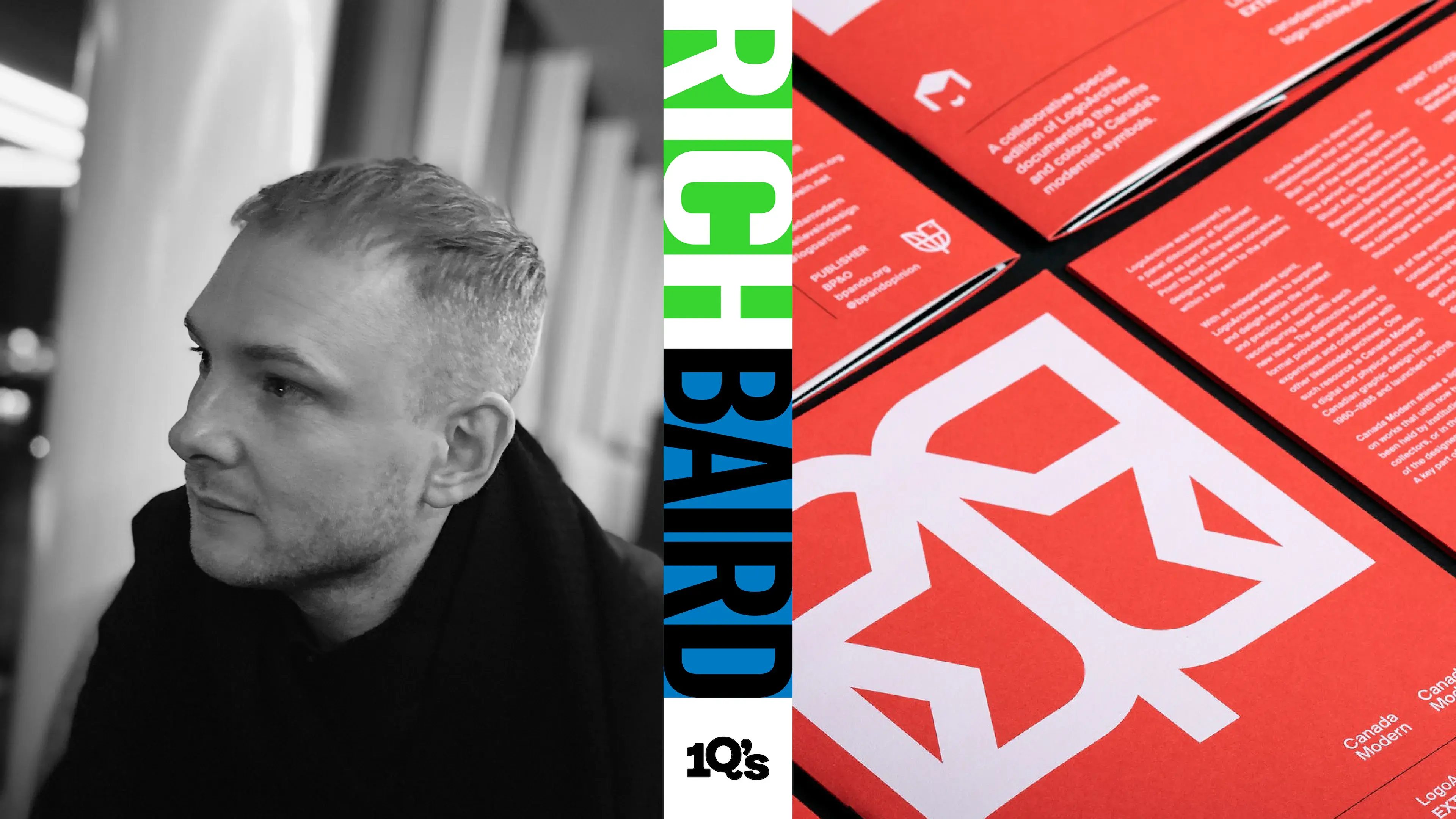
10?’s with designer, writer and publisher, Rich Baird
Running the highly successful Modernist logo archive, zine series and international research programme: LogoArchive, the distinctive point of view on brand identity, design and packaging blog: BP&O and most recently the weekly newsletter telling short stories on modernist logos of the past: Logo Histories, alongside his own design practice.
It’s fair to say Rich Baird is a busy man, but he took the time to answer our 10 questions where he reveals more about his passion and knowledge of logos and his vision for the future.
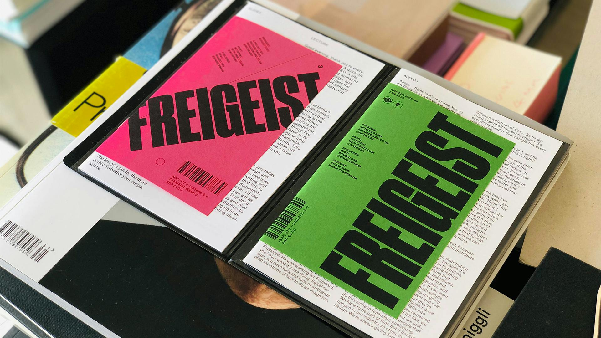
Logo Archive, BP&O, Logo Histories, Freigeist Zine and of course Rich Baird the designer, how do you fit it all in?
I get up early. I try to minimise procrastination and found a good working spot to focus over long periods. I’ll also work across weekends, switching more towards holidays as breaks. I meander quite a lot between various projects instinctually throughout the day but would like to see myself as disciplined. I drink lots of coffee and I really enjoy the work, that makes it easier to fit it all in. It is worth noting, that there is a cost to working like this.
You studied furniture product design at university, what drew you to graphic design? Do you still carry any of those furniture product design learnings in your work today.
In some ways yes. Although, until more recently I would have said no. Working in graphic design for so long I’d forgotten that time at university, but now looking back, and considering the fascination I have with materials and their assembly, it would be naive not to acknowledge some form of continuity there.
You undoubtedly put huge amounts of time and effort into all your various businesses and have now moved to a subscription format for Logo Archive and BP&O. Was that a challenging decision to come to?
I make decisions quickly. Overthinking for me just leads to inaction.
The challenge for me really lies in execution, finding people that were able to build out what I had in mind, and making sure that they had an investment in the long-term future of a project that could grow.
On top of your zines, blogs and websites covering the world of design, you’re also a practising designer. Is there a side of your job that you prefer?
I try to see things in totality. One practice informing the other. I need self-initiated work to develop certain skillsets in a boundless and unregulated manner, conversely, working with clients and restrictions, I cultivate other skillsets that require regulation and are goal-orientated.
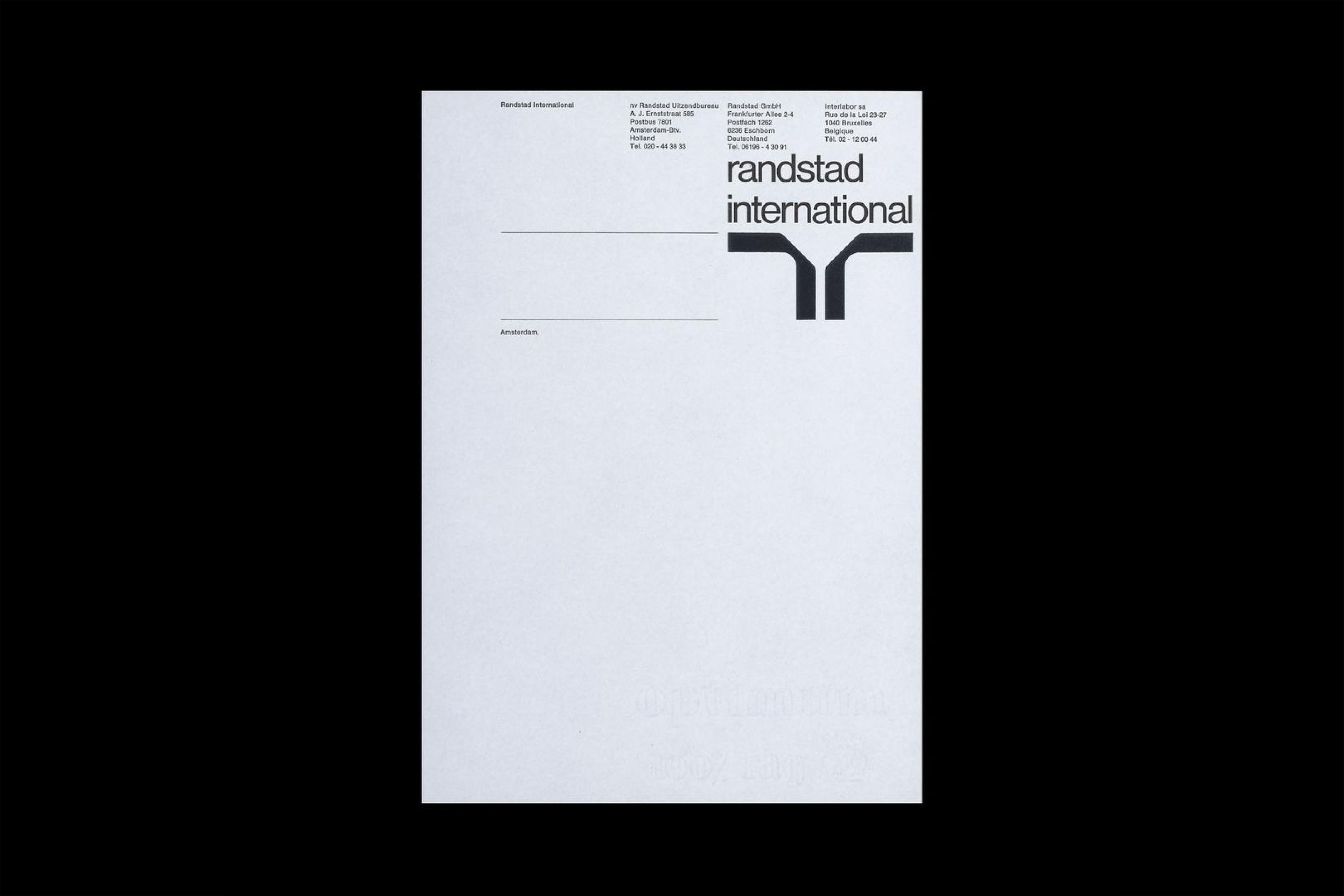
Brands update their logos regularly with the average age of a logo about 10 years but some brands have remained loyal for longer: Randstad by Ben Bos/Total hasn’t changed for over 55 years now. At this point can a brand really update something as iconic as this or are they forever destined to work around it?
This is a great question. I could generate a few different points of view on this. So I’ll just pick one. We’re in late-stage capitalism. That logo will last as long as the people in charge of it think it has value. If it becomes too much work/costs too much money to work around, they’ll replace it
There’s a well-known story on Twitter that goes something like this:
- Brand X goes through a strategic change.
- As part of said change, Brand X changes its logo to better reflect that change.
- The design community on Twitter have their say on the updated logo.
The context of change is often lost in the ‘consume-by-the-second’ world we live in. Is it the design community’s responsibility to try and better understand the reasons for change before making a judgement, or is the lightning rod of logo design change warranted?
There’s ‘community responsibility’ and ‘individual responsibility’. The former would perhaps be, institutions and blogs and those with influence to put forward a reasonable and considered point of view, with the hope that that will catch on. Specifically, a framework for critical evaluation (context, culture, concept) not ‘taste-making”. And if I’m being honest, that’s not always the case, there are some trivial points of view coming out of some influential points (new and legacy), and far too much taste-making going on.
Then there’s ‘individual responsibility’. That’s simply for one person to decide what has value in the world to them and what doesn’t. It isn’t for anyone to decide what this is other than themselves. If they want to drop a one-liner on Brand New, fine.
If someone wants to drop a one-liner on Twitter, about a one-liner on Brand New, fine. But there are far more interesting things to read or do.
The use of symbols in logo design seems to have been going through somewhat of a revival in recent years. Are there any particular periods of design history that reflect logo design in 2022?
Fundamentally, it is technology that is the key driver. The mid-century saw diversified services and products, and the need for a more international visual language, a similar thing is happening online today.
Logos once had to operate across a variety of material products, which demanded rationality and simplicity, in the same way, today, logos require a simplicity in which to operate across different devices and screen sizes, and further, in ways that are static and dynamic. Similar requirements have produced similar responses; simple symbols that can take many treatments, and function well across diverse use-cases and across stratified markets.
Are there any periods of design history that remain a mystery to you? Or any blind spots that are difficult to research through little documentation?
Absolutely. We’ve had plenty of documentation given over to European and American design. We have a lot of materials on Wim Crouwel, Paul Rand and Saul Bass, on Bauhaus, Italian design, and mid-century modernism. What we’re missing, and what is largely undocumented is work from the Middle East, the African nations, and South Asia.
These have been underrepresented in the past, mysteries and blind spots, but we’re trying to address that by creating a platform that supports and gives visibility to a network of researchers in these countries.
What’s next in the world of Rich Baird, how would you like your various practices to grow in the coming years?
There are a couple of things that are showing potential, and really coming from the LogoArchive community of researchers, and not directly from me. For example, Menahil, who runs LogoArchive Pakistan, has integrated a logo histories module into the design school IVS and has constructed a proposal to bring this to other universities, as well as end-of-year exhibitions and publications.
This, for me, is the most exciting thing, when other people take what you’ve done and come up with better ideas.
Finally, we promised we wouldn’t ask you what your favourite logo is… but who are your design heroes, or heroes in any sense?
I’ve never really been a fan of anything, or of anyone. That’s not to say I’m not passionate or deeply respectful of those that came before, only that there’s so much fascinating work out there, and a lot of pioneering designers, it just doesn’t feel right to pick any one person.
Rich Baird is a British freelance designer and writer and believes that effective design exists within the liminal space created by utility, intellect and design craft. Put differently, effective design has purpose, invites meaning-making and is created with care and creativity, be that a simple logo or brand strategy and brand identity.
Past clients have included architectural and interior design firms, homeware brands and fashion labels, photographers, insurance brokers and law firms. Richard is based in London and works with international businesses throughout Europe, across America, China and the UAE.
Rich, alongside his corporate clients, has also developed two publishing businesses; BP&O Ltd. and LogoArchive Ltd.
Questions: Ash Watkins
Editor: Craig Berry
Check out...