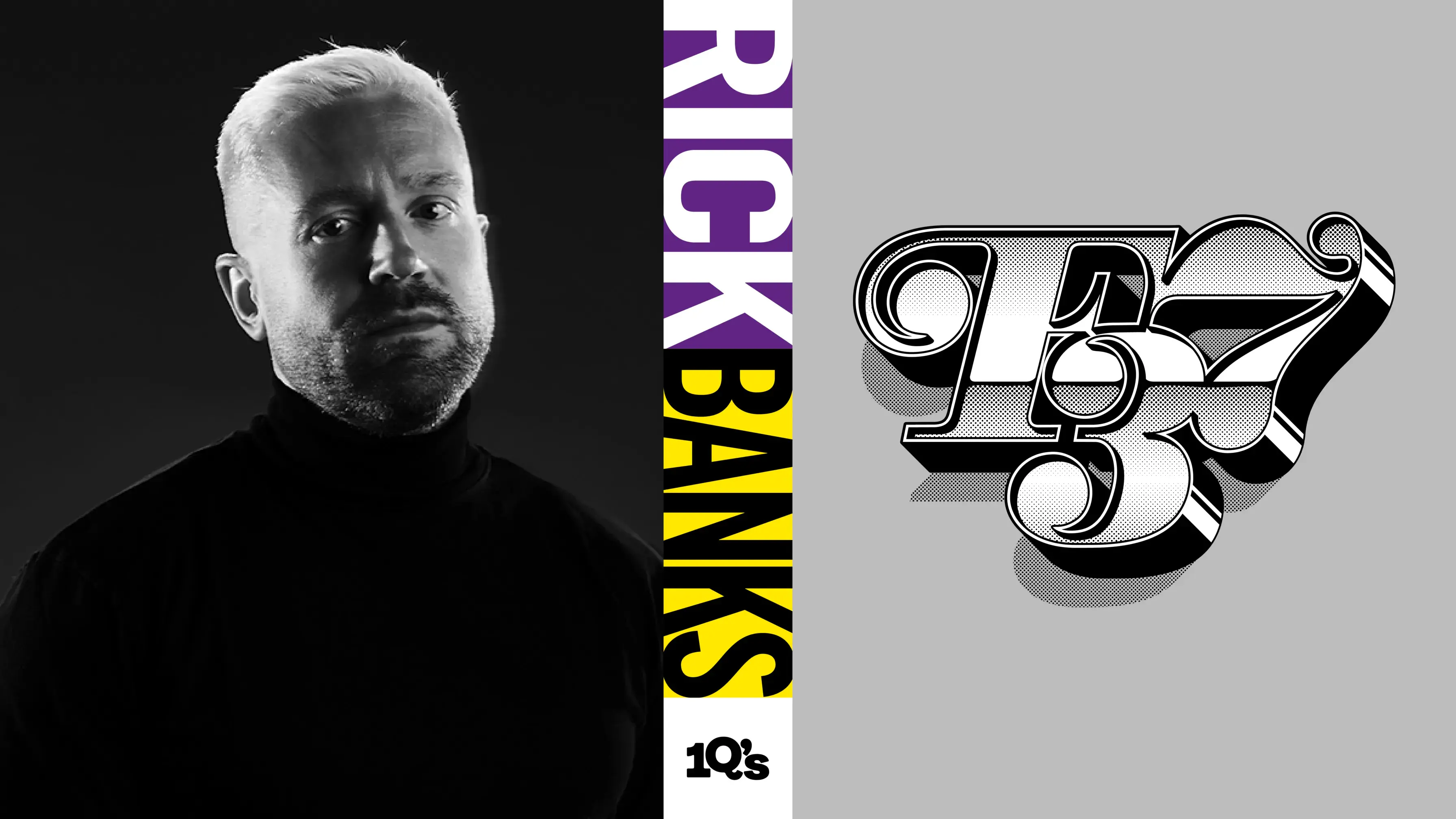
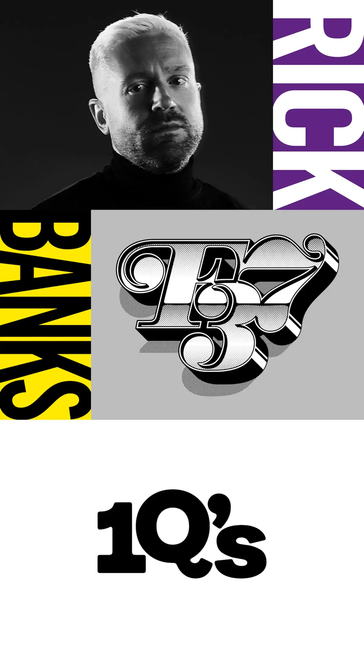
10?’s with graphic designer & type designer, Rick Banks
Rick Banks is an award-winning graphic designer based in Manchester. Having worked for some of the most renowned studios in London, he then founded the successful type foundry and design studio Face37, later becoming F37®.
He’s a friend of the studio and also worked together with us on several projects. We hit up Rick with our 10 Questions to get to know a bit more about what it’s like running a foundry/studio and our shared passion for design in football.
First off, your type foundry and design studio is called F37® (formerly Face 37), but what is the significance of the number 37? We have to know...
Believe it or not, it comes from a wrestling game! It was a personal joke I had with my friends when we were 14 years old at school. We played a game called WrestleMania on the Nintendo 64 where you could customise your own wrestler including what facial expression you wanted.
Face number 37 was hilarious and it became a running joke at school. Fast forward to university and I needed a cheap .com URL so I bought face37.com and it’s just evolved over time to F37.
F37.com was a lot more expensive than face37.com!
F37 encompass both graphic design and type design services. What do you find enriching about the dialogue between using type and creating type in your practice?
You’re right. Our offering is quite unusual in that we are a font foundry [F37 Foundry] and a design studio [F37 Studio]. Both do three things.
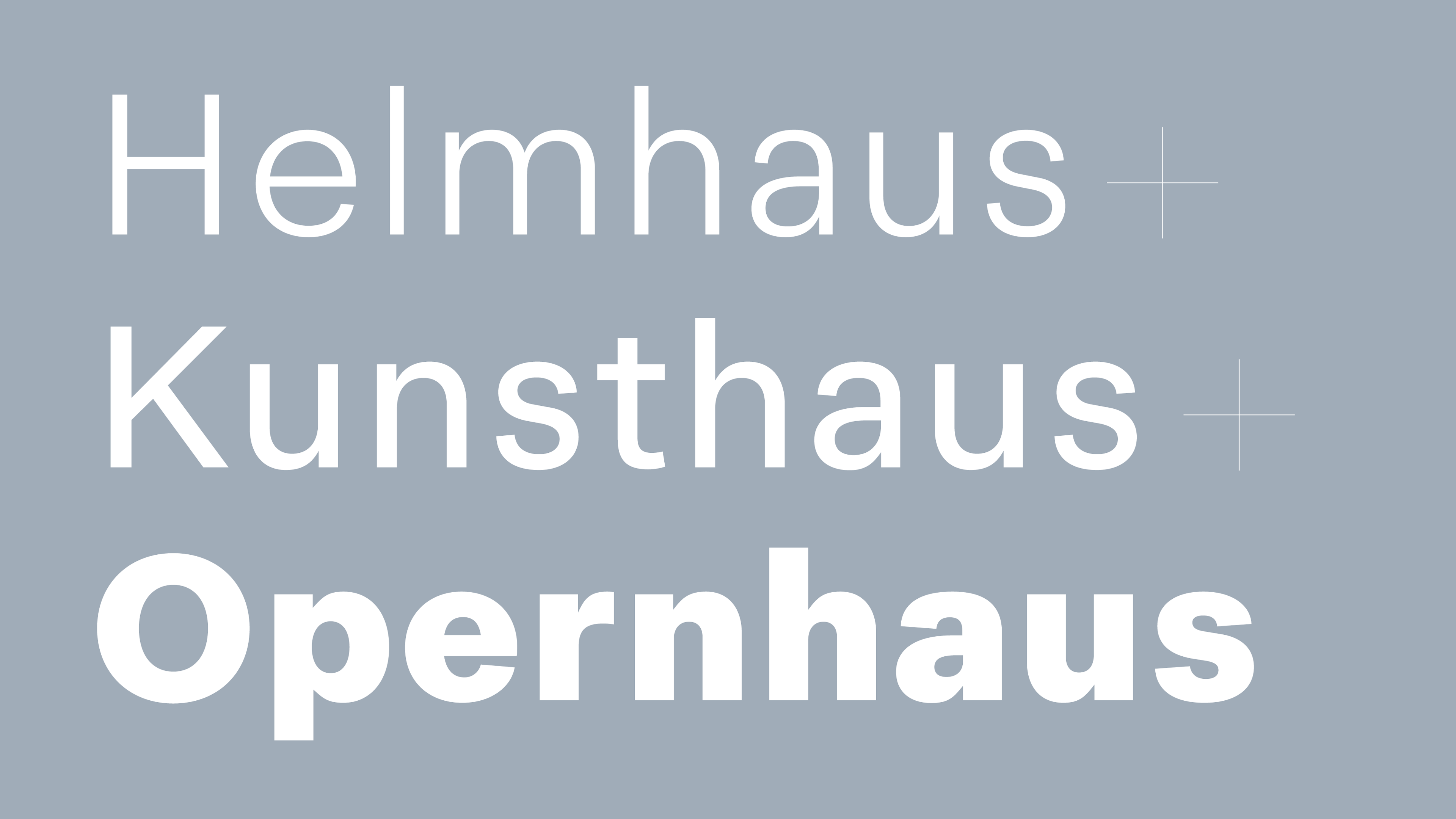
The font foundry designs retail fonts, custom fonts and crafts logos. The studio specialises in branding, creative coding and publishing.
There is a lot of crossover between the two which I love as I think that’s what makes us unique. For example, the graphic designers influence the fonts and the type designers influence the branding.
Some are named after cultural references, others are geographical, others scientific and some we can’t quite work out... What’s the thought process behind the names of your typefaces?
There isn’t an actual process as such. Naming as we all know is very hard. Sometimes we know the name right from the start of the design process.
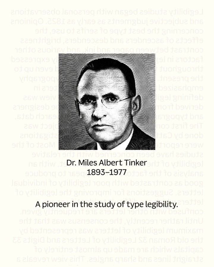
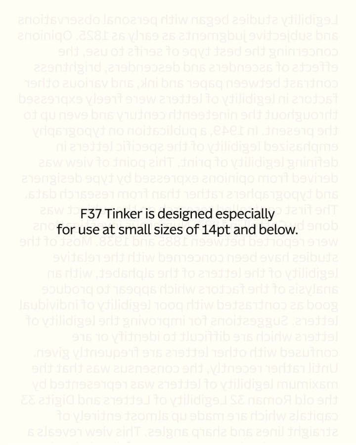
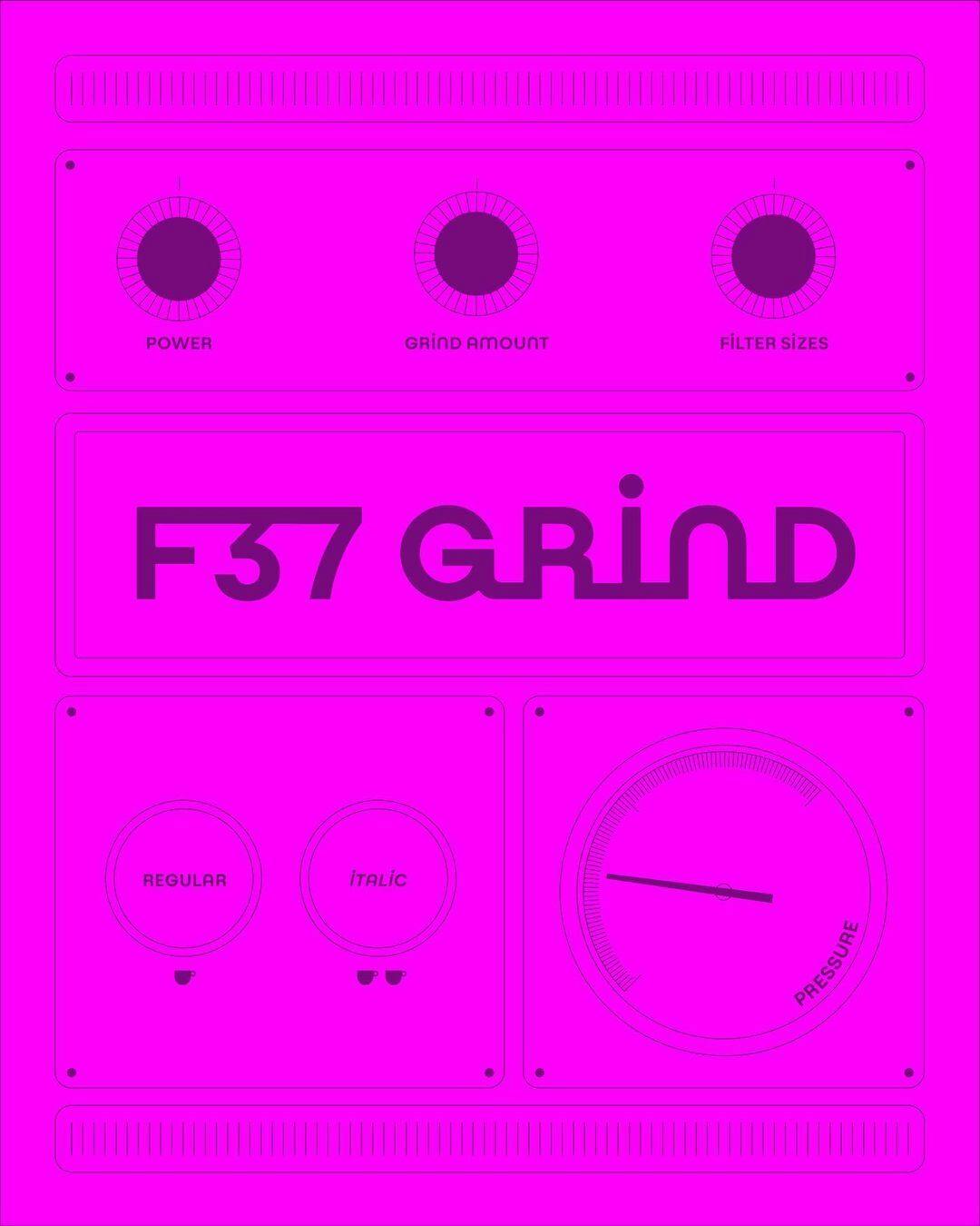
Take F37 Tinker for example. That typeface was always going to be called that because of the academic, Dr. Miles Albert Tinker, a pioneer in the study of type legibility. Because accessibility is a big thing in type at the moment it’s sold very well — so much so we are designing more Tinker styles at the moment.
Some fonts are simply named because they look good in that word! We like to approach the naming like we would a brand and create a little design world for that font.
Can you describe what it’s like to start and run a type foundry in one word?
Stressful!
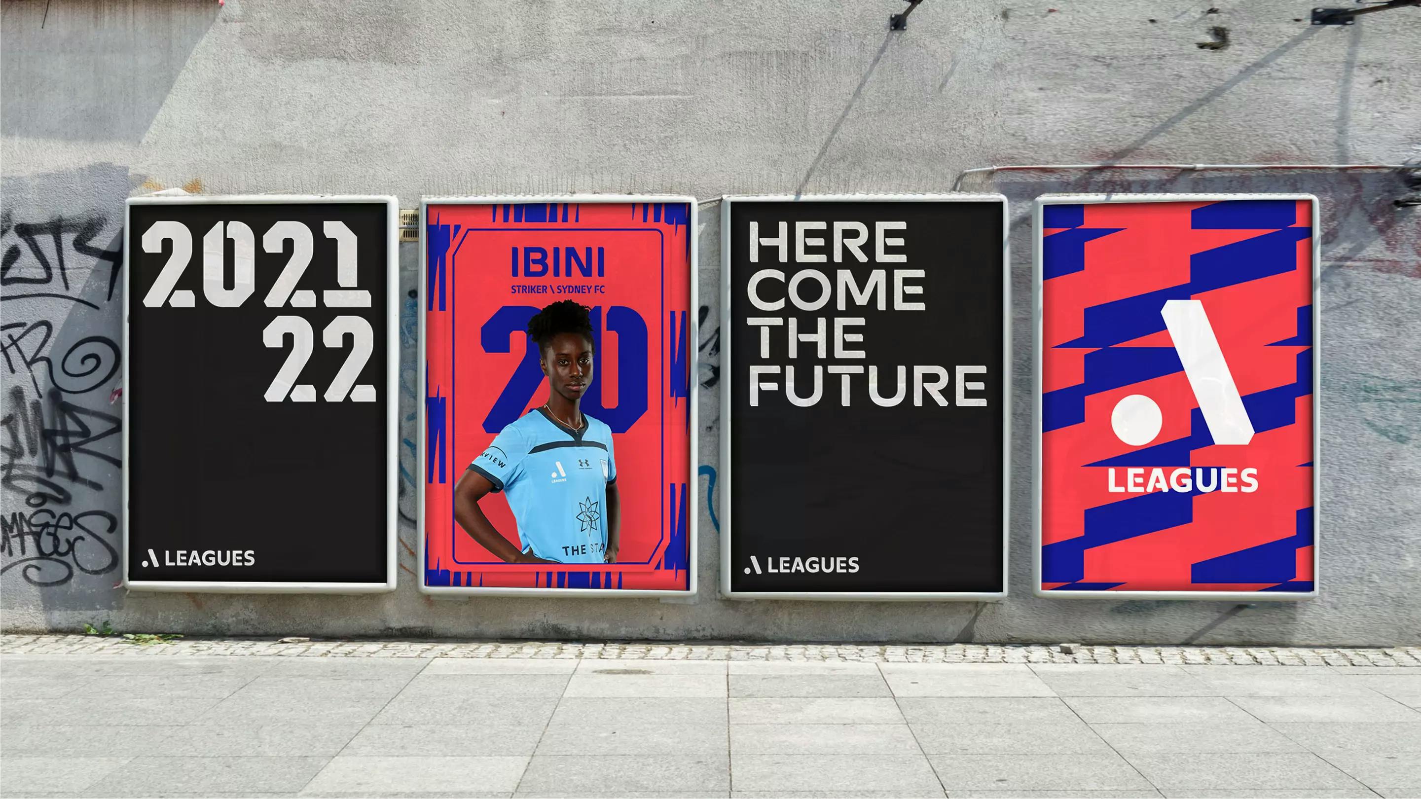
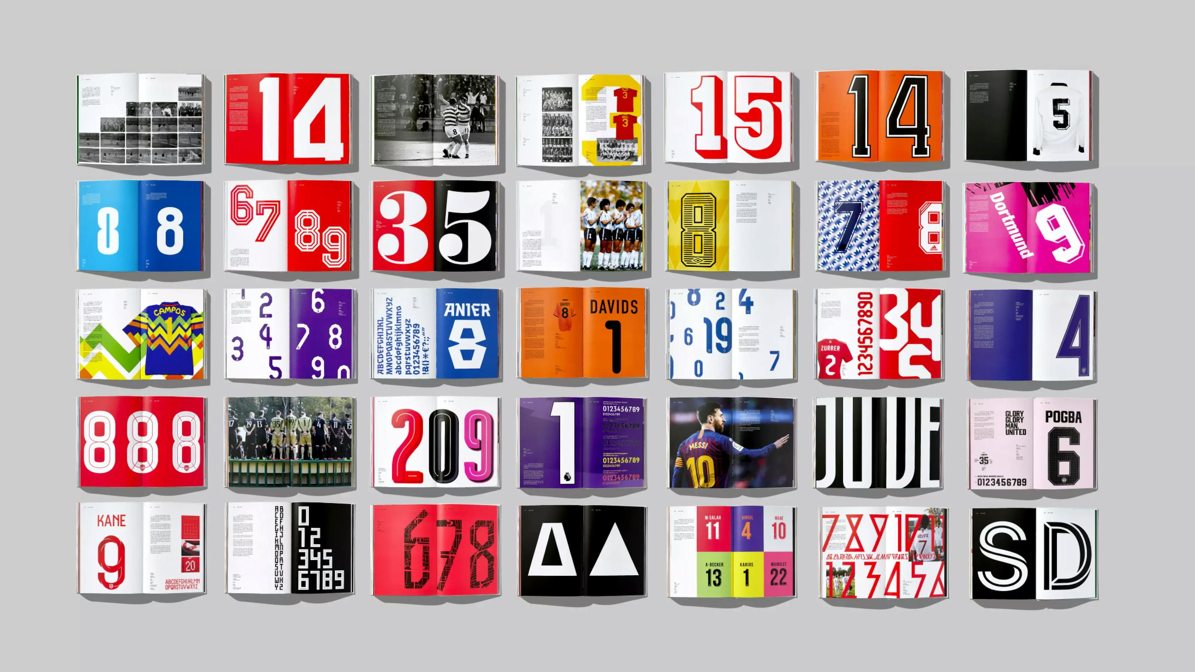
Having published numerous books on football shirt typography you must be an expert in this field and are clearly passionate about them but for the average football fan, the design probably isn’t that important, arguably going unnoticed… Is that a problem?
No, I don’t think so. Some of the best design goes unnoticed.
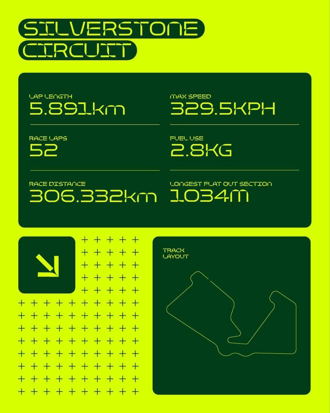
Think of the various airport signage systems or the wonderful iOS fonts you look at as soon as you wake up. However, with our MLS and A-Leagues shirt lettering, they didn’t want something vanilla, like in the Premier League. They wanted to stand out, be individual and more importantly be more memorable.
In terms of semiotics, Harvard Business professor Gerald Zaltman says that 95% of our purchase decision-making takes place in the subconscious mind and I think people know when something has been well designed or not.
Footballers have to wear numbers, so why not make them eye-catching, meaningful and unique?
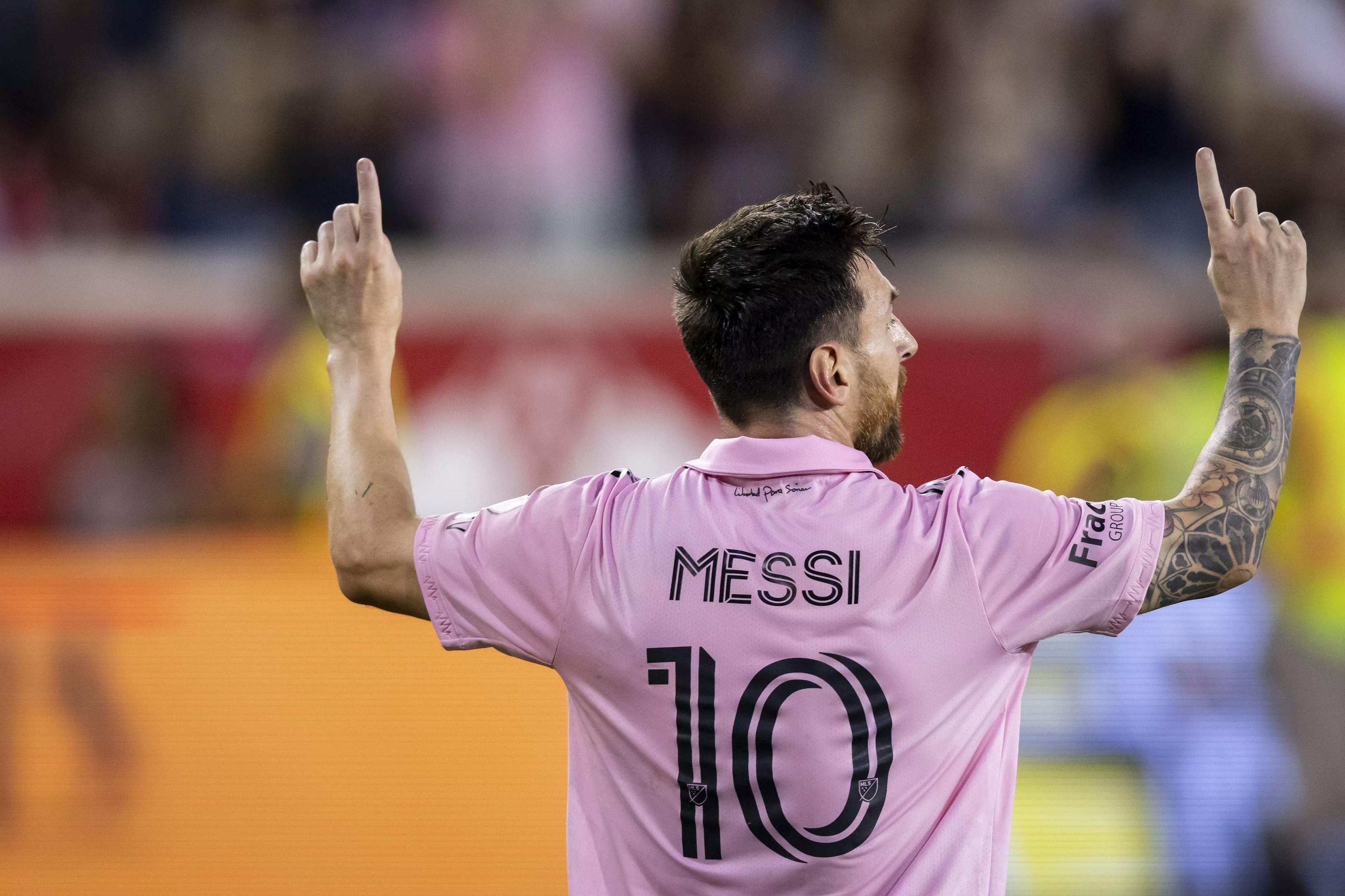
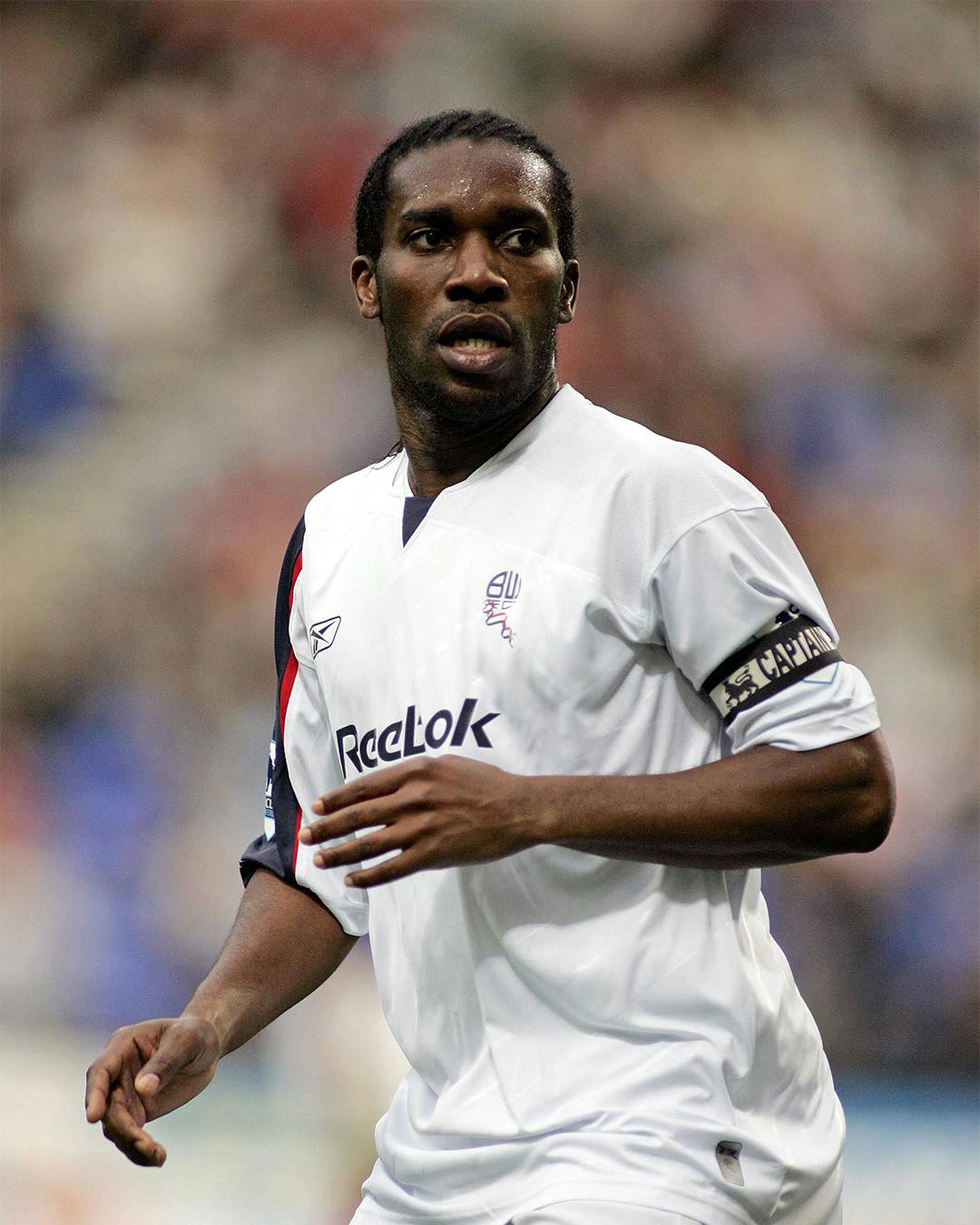
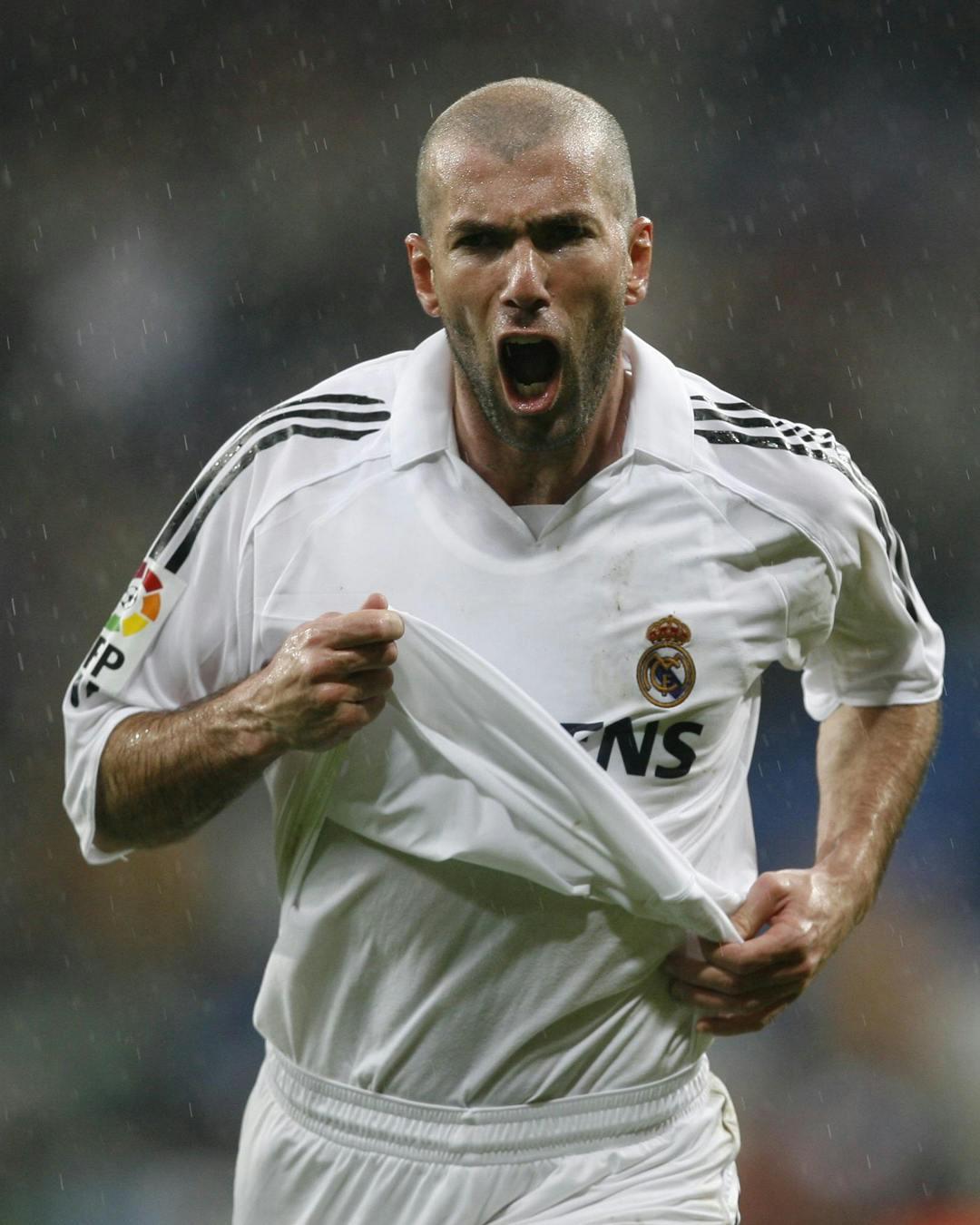
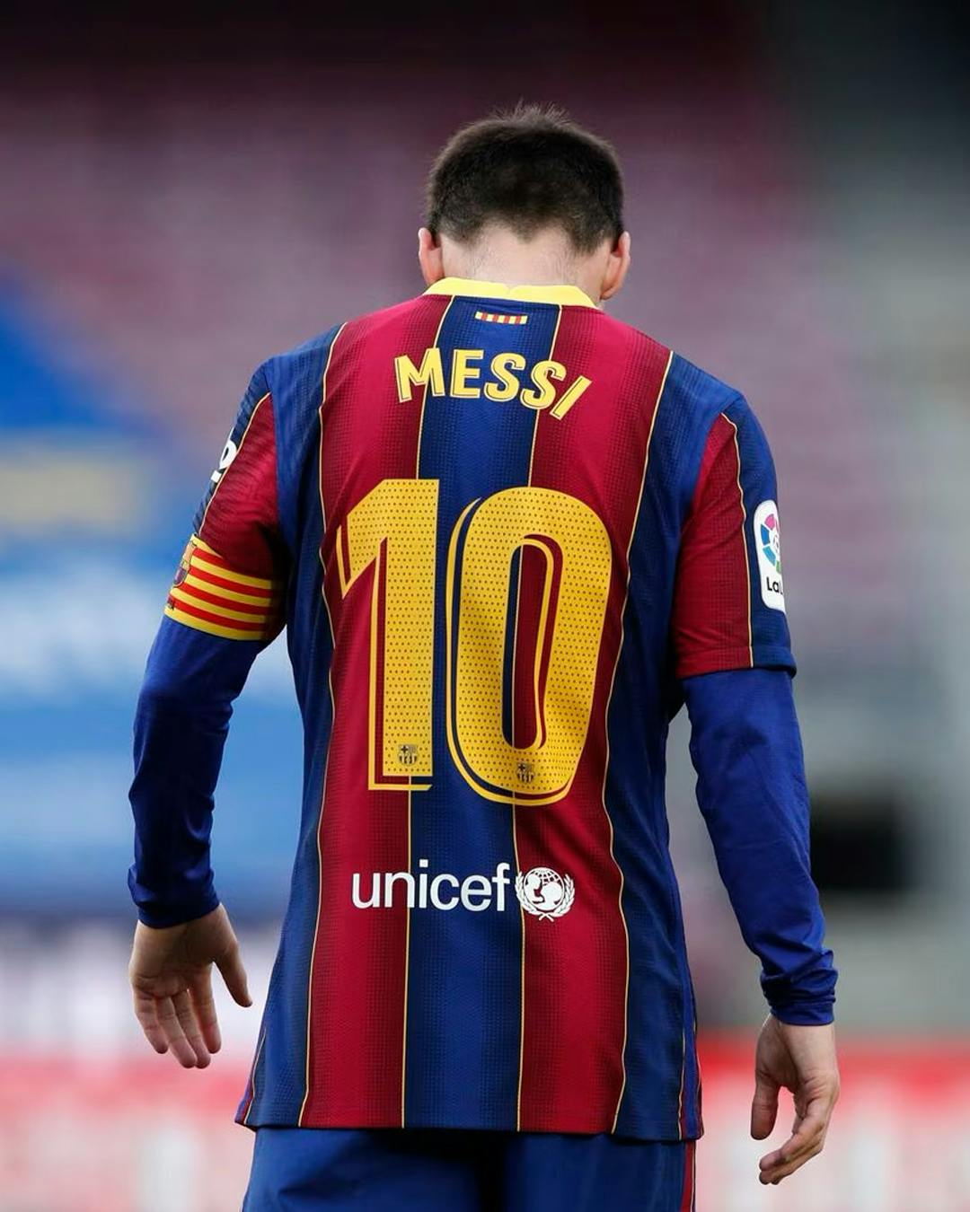
Can you give us your top three football players of all time?
Okocha. Zidane. Messi.
What was the inspiration for starting your The Modern Game blog and do you ever think you’ll bring it back?
I’ve always been interested in the role design plays in football. When Dan Greene and I launched TMG (The Modern Game), in 2015, design in football was slowly on the rise and we wanted to celebrate it. It was great for a couple of years, I got to go to the Champions League final and many press launches but producing the posts involved so much time and energy on top of our jobs. Now we both have children on top, we just don’t have the time to revive it — never say never though.
What gives you and your foundry a greater sense of achievement: creating one typeface that thousands of people can use, or one unique typeface that only one client can use?
Good question. I’m going to chicken out and say they are both great.
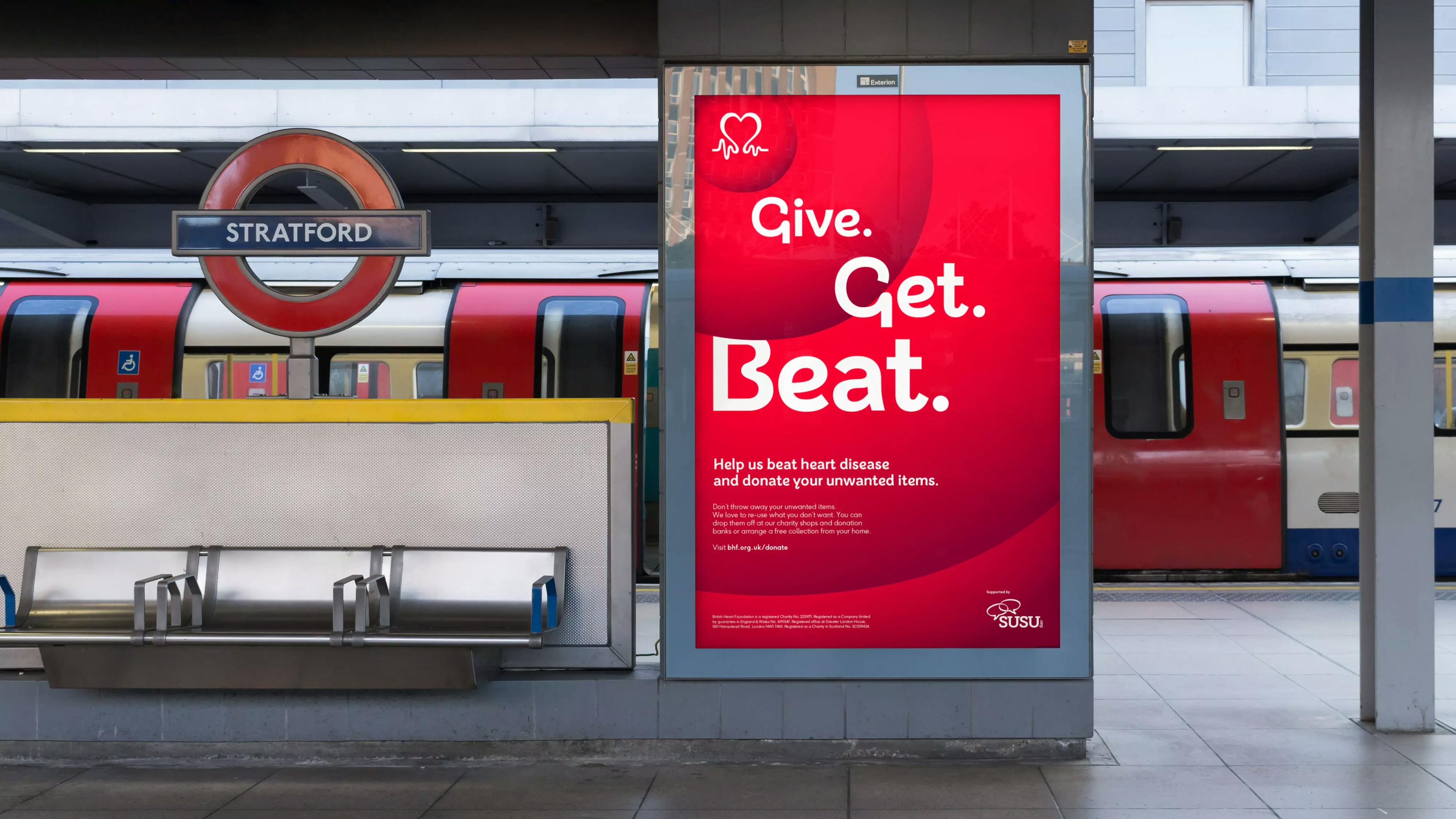
I love seeing designers take one of our retail fonts and use it in an unexpected and beautiful way. There is a great sense of pride when I see the British Heart Foundation font across the country and it’s so recognisable to the brand now, that you can tell it’s BHF without seeing their famous logo. When that happens you know you’re on to a winner, especially when it’s helped see an increase in one-off donations by 26%, which I think WE ALL know is solely down to the font!
We all know that the exciting work that design studios share online isn’t all they’re doing, they’ll always have the less exciting but more profitable jobs to secure cash flow and business stability.
Is there an equivalent in type foundries? Are there certain must-have typeface styles to keep your business running?
I think every foundry has a geometric sans-serif or a Swiss grot and that tends to be their best seller! We have F37 Ginger and F37 Blanka which are big sellers.
To counter those well-trodden styles, I encourage play and experimentation in the studio. That’s why we launched F37® Playground. This is a platform where our designers can have fun pushing the boundaries of what’s possible. Hopefully, the platform can be a place for us to inspire and educate graphic designers, motion designers or anyone else in the sector, about the creative possibilities of Variable, Color Font and OpenType® technology.
We want to become pioneers of challenging that traditional idea of type being a passive and static product.
Finally, what’s the best thing about your hometown of Bolton?
Being around my friends and family — especially with two small children.
(Definitely not Bolton Wanderers at the moment!)
Rick Banks, is a designer from Manchester and is the founder of F37®. His work has won numerous awards, including a yellow pencil from D&AD and a TDC from the Type Directors Club in Tokyo. He has been featured in the Creative Review Annual, as well as receiving recognition from the respected Creative Circle, Communication Arts, TDC (NY) and ISTD.
Check out...