Packaging and the Power of Perception
How brands (and designers) can shift our perception of products through the perspective of design.
Written by Craig Berry, Designer & Writer at Nomad.
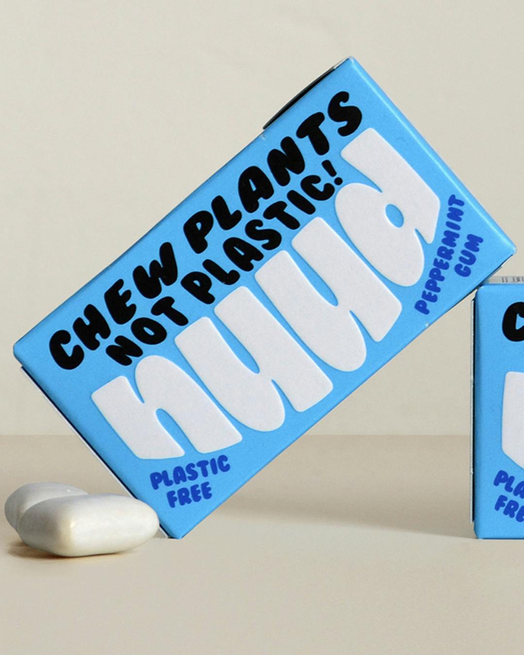
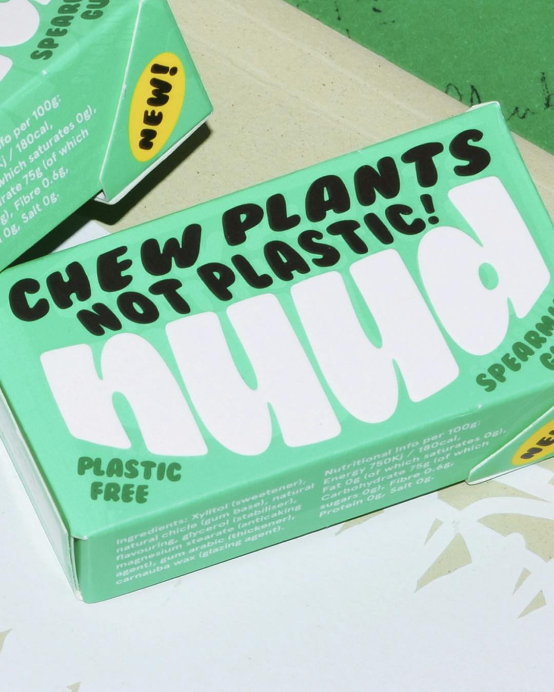
Last weekend I saw an ad on Instagram for a new product: vegan, biodegradable, plastic-free chewing gum. I have never had the desire to buy vegan, biodegradable, plastic-free chewing gum (I hardly ever buy chewing gum actually) but I soon found myself cycling 20km to the nearest Morrisons that stocked it and started scouring the aisles for it like a hound on a scent. Why? Because, in my opinion, the branding and packaging looked great; super colourful with playful typography (respect to Mother for this design) and therefore, I wanted it.
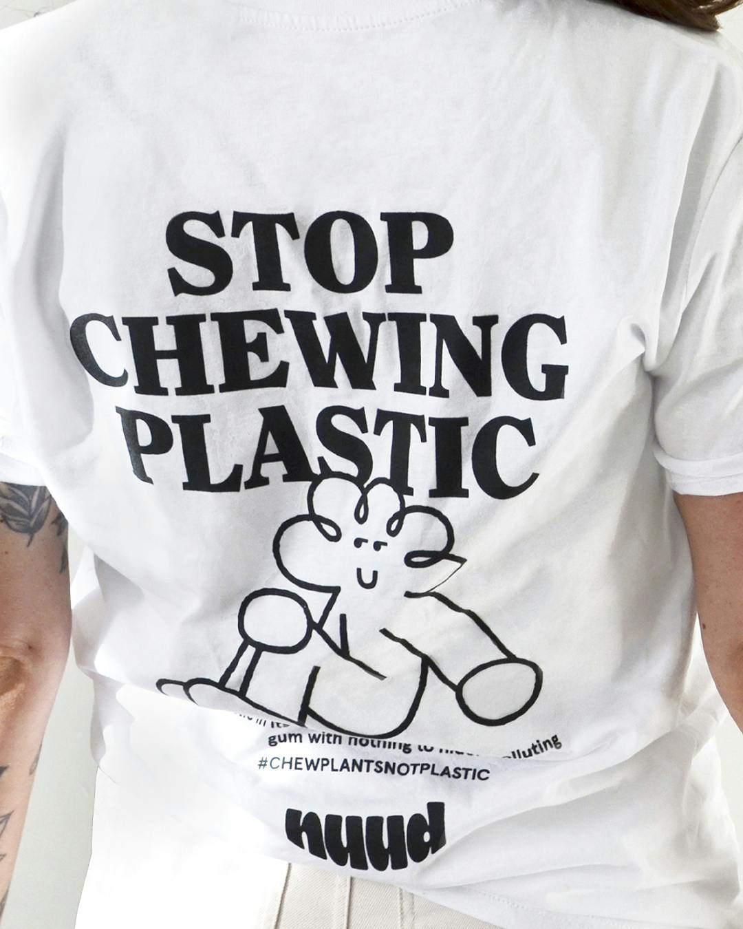
After all that though, did it taste good, you ask? No. My honest review is that it tasted amazing for about 30 seconds and then the flavour jumped off a cliff and it was like chewing bland glue.
But this blog post isn’t a chewing gum review. However, if the side-effect of a plant-based, plastic-free, biodegradable is a lack of long-lasting flavour but will ultimately benefit the planet; that’s fine with me.
The same weekend my wife and I went for a walk around Victoria Park in East London and stopped off for a coffee in Hackney. Pro tip: while waiting for your barista to pour your over-priced takeaway coffee, to avoid awkward small talk try taking an interest in the place’s interior and look at what other things they sell.
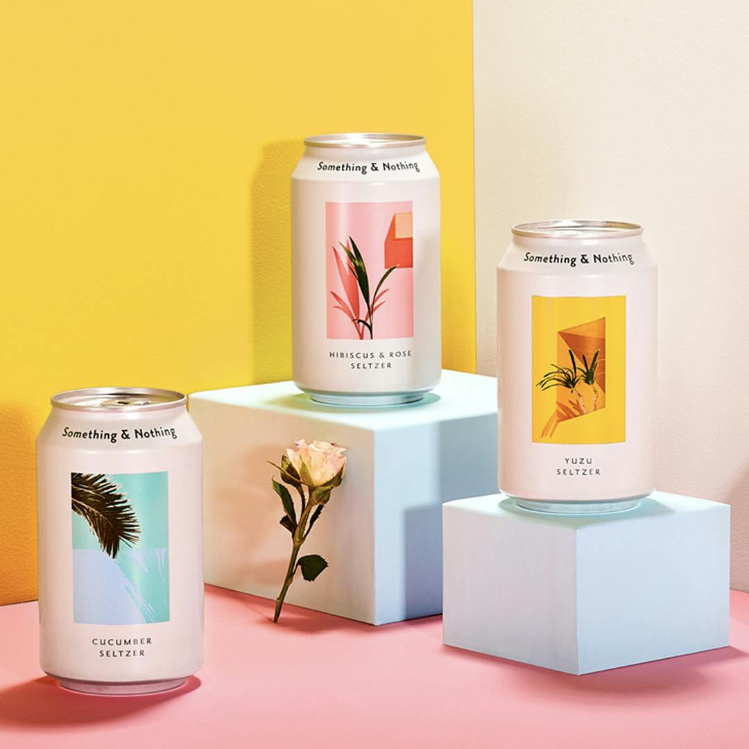
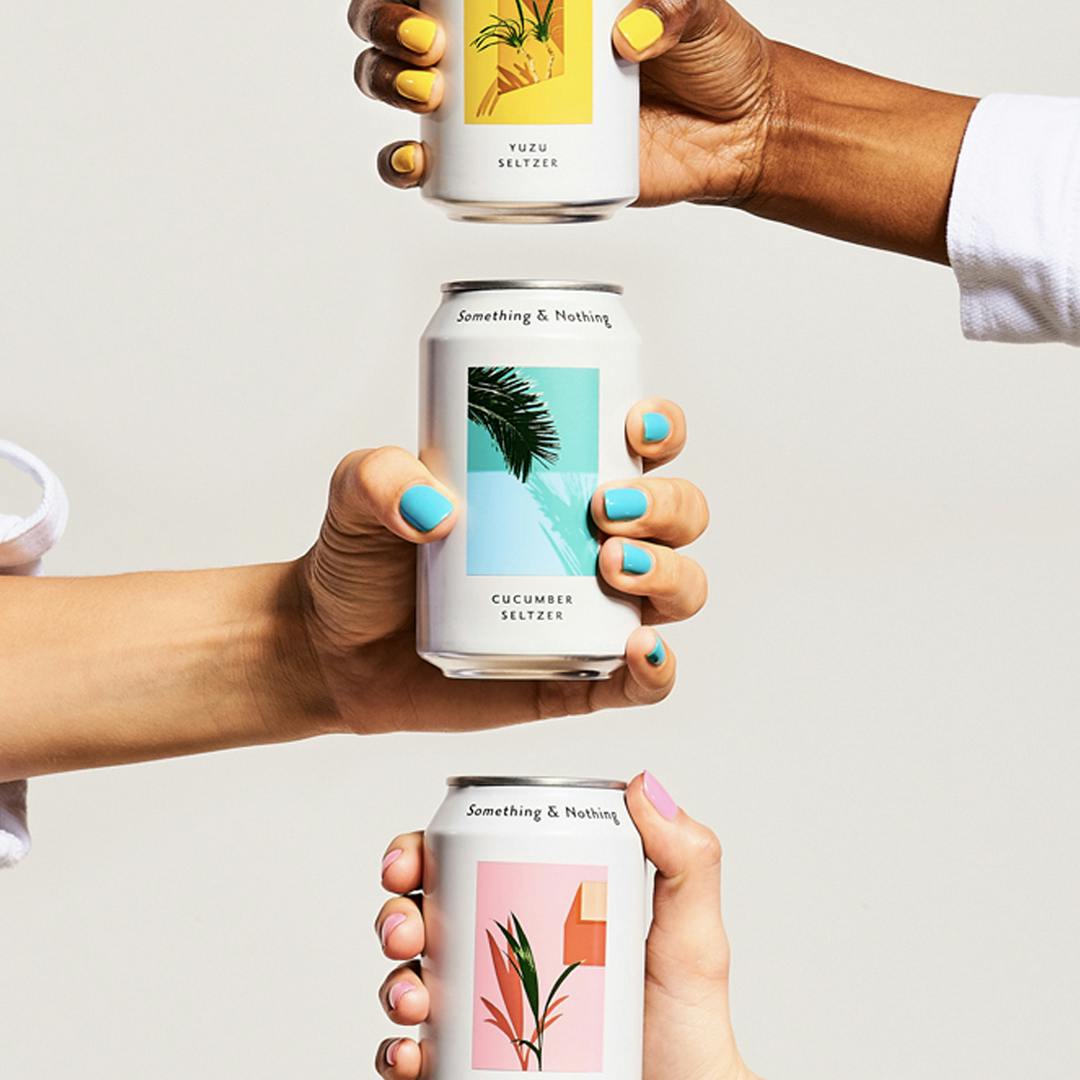
We’ve employed this tactic numerous times and weirdly when actually looking around East London coffee shops the same product is usually to be found, usually next to the brown bottles of kombucha is this brand of ‘hard-seltzer’ aka flavoured alcoholic sparkling water called Something & Nothing.. Every time we see it, one of us goes ‘oh there’s that drink again, it looks nice, we’ll have to try that one day’. We’re still yet to try it.
We have no desire to drink ‘hard-seltzer’. But the only reason it gets a look in is because of its packaging design; the crisp white can, clean typography and a seemingly random photograph (courtesy of design by Studio AS-CC).
I can only imagine the taste of this drink will not live up to its design expectations.
What’s going on here? Are we as consumers being tricked into thinking, if it looks good, it’s going to taste good? Is the old saying of ‘don’t judge a book by its cover’ still relevant? Yes, I know that the saying isn’t literally about books, but every day we as consumers are bombarded with things that require and demand our judgement when all we’re presented with is their outward appearance, be it books, beers or bread.
It’s in our nature to be drawn to new things and especially as designers, we pay a lot of attention to how things look.
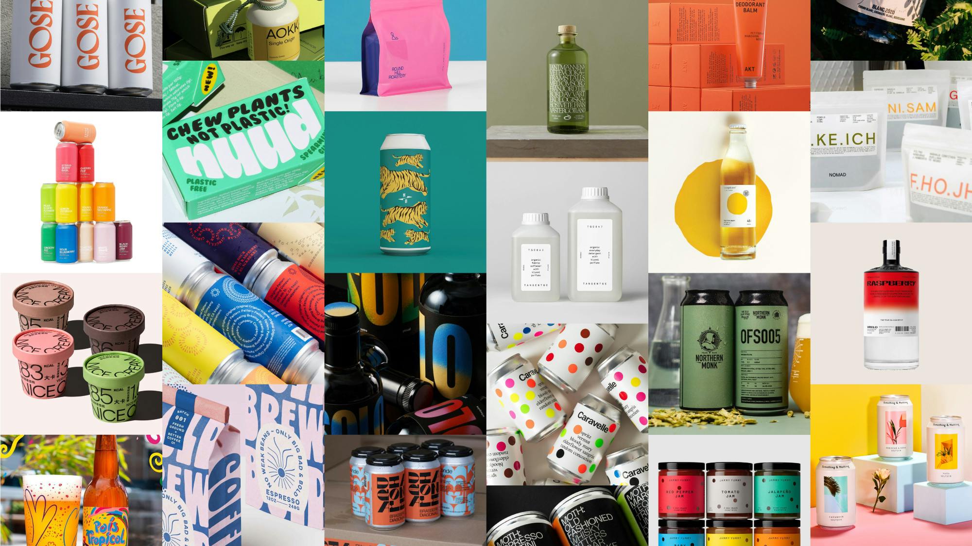
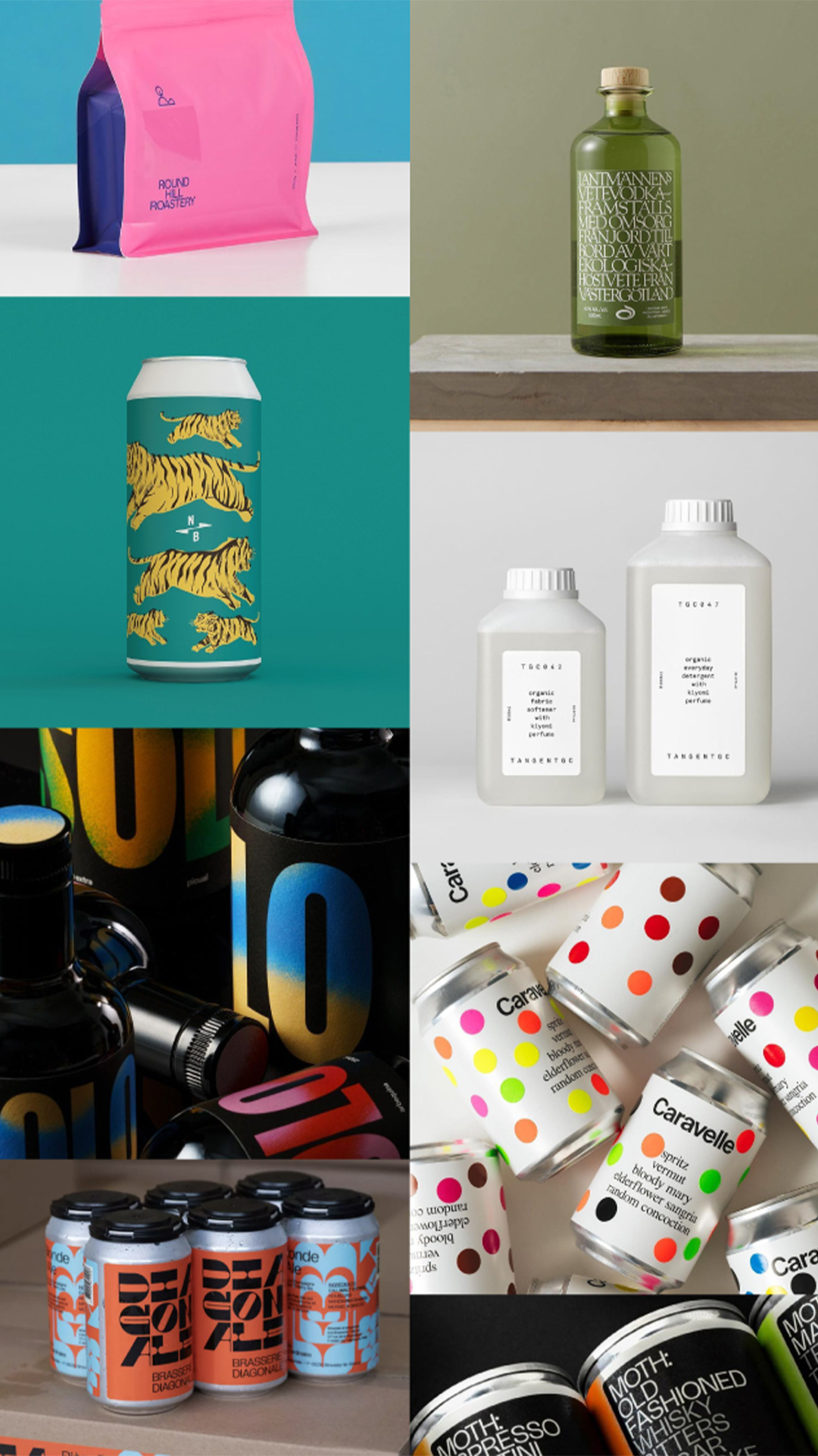
Every time I visit a supermarket it’s a visual overload of logos, colours and fonts. Everything is fighting for your attention and the truth is that most of it is rubbish. Rubbish in a nice bit of packaging. It’s visual lies, but we all fall for it. Every time we know we do, and we carry on doing it because we like new and shiny things.
But, there are different ways of thinking about it. There’s been a few times where I have seen a once awful looking product and its packaging be rebranded and my perception of it totally flipped. I’m using a lot of food and FMCG product references and examples here as these are things that people (unknowingly) care the most about; picture these two scenarios:
Scenario #1
BMW shows off their new logo and brings out a new electric car.
Average consumer: ‘wow, looks cool. I don’t have a BMW though so why do I care.’
[clicks onto next Dezeen article and forgets about that new logo in approx 4 seconds]
Scenario #2
Pringles shows off their new logo and brings out a new can design.
Average consumer: ‘WTF is this shit?? Why have they done that? Ew that looks terrible, I’m not buying those ever again.’
[picks up every can and waves them around to get the point across before throwing them back in disgust]
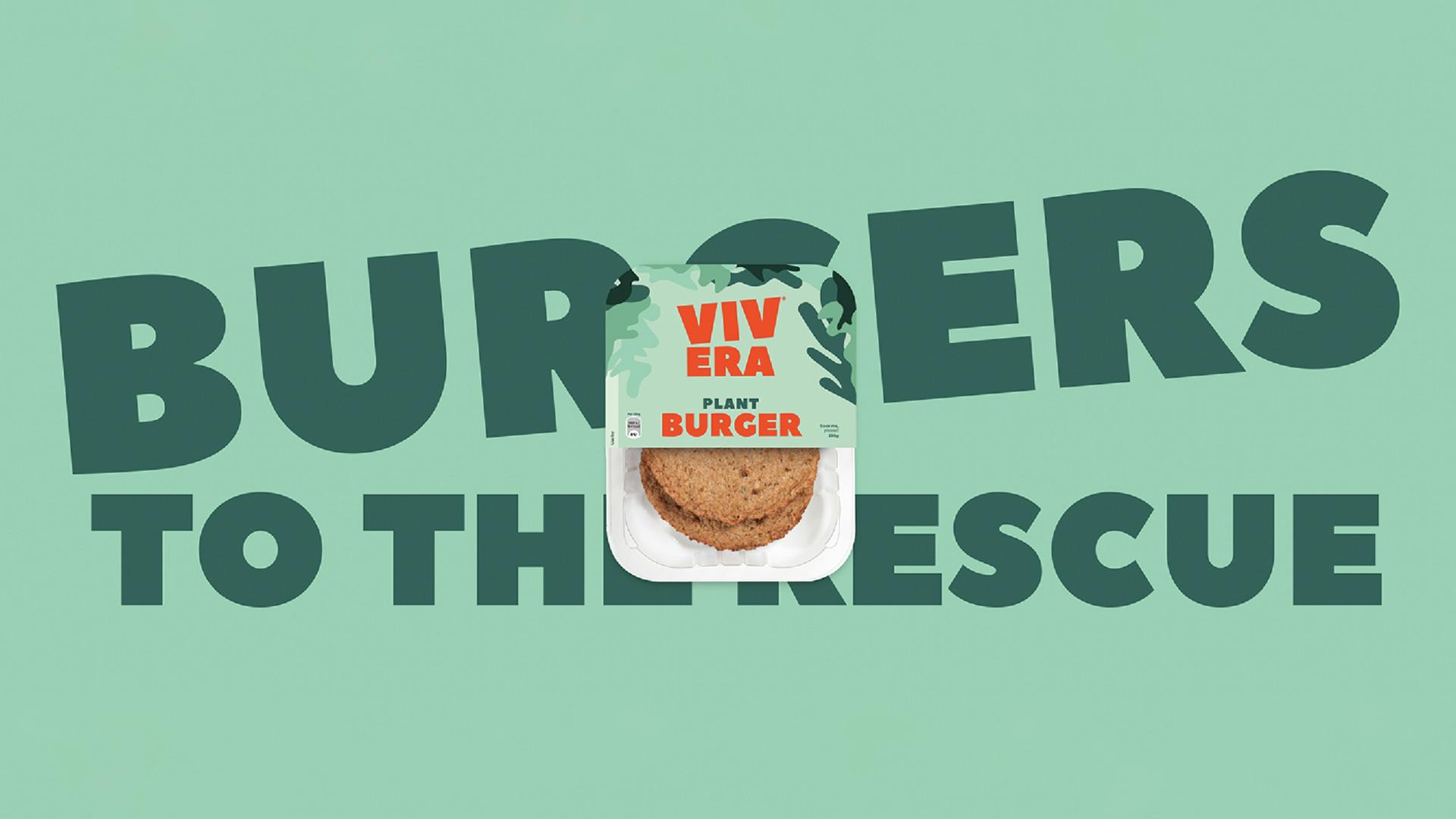
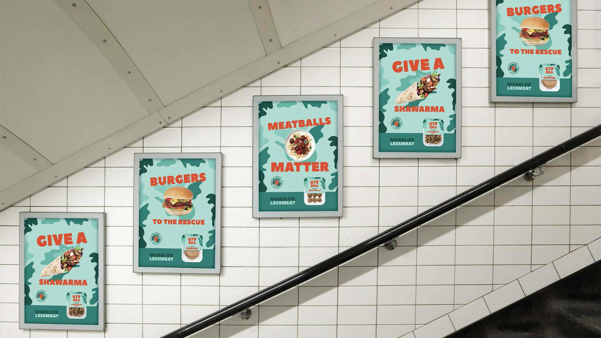
The big one that stands out to me is that of packaging for processed vegan food aka meat replacement products. I remember a time when vegan (and vegetarian) processed food products were all about either looking overly scientific, overly vegetarian (green) or overly lacking in design. Vivera was the first one that got me like this, albeit the design of the recently new packaging (and rebrand in general) is not amazing or going to win any awards (sorry not sorry) but to go from hardly getting a look to looking for it every week is surely the testament of good design. And it tastes great. It probably tasted great before but I’d never have bought it purely because of the rubbish packaging.
And I’m sure there are loads of these things out there, things that look bad but taste amazing; that is where ‘don’t judge a book by its cover’ comes back in.
Maybe when you’re doing your next food shop, take a risk on a bad looking bit of packaging. Or, don’t, and maybe you won’t get fooled by good design and marketing.
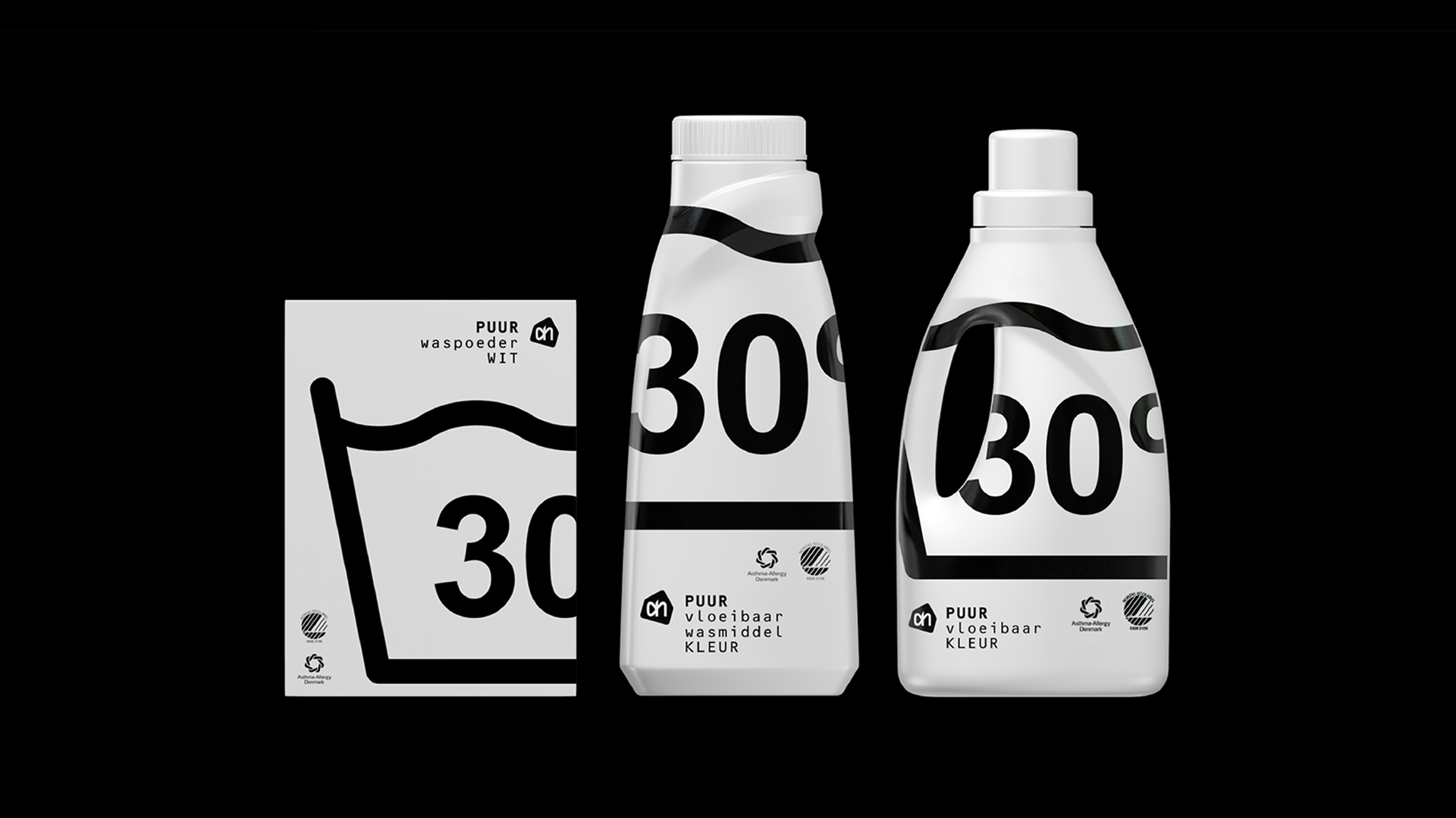
A few years ago, I entered a packaging design competition while working at an agency that had a specialism in packaging design. Spoiler alert, I’m not a packaging designer nor have ever confessed to being. The brief was to adapt a supermarket laundry detergent line into a new and more ecological design and I took this brief as an opportunity to present my thoughts on commercial packaging. The result was a (slightly) subversive reaction but still answering the brief of being ecological*.
*less inks used, no additional plastic labels, strong encouragement to wash at lower temperatures etc.
Inspired by the likes of Virgil Abloh and other ‘new age’ designers my design concept was totally functional and had no visual lies. Using a monospaced typeface, bold and graphic icons and with the absence of all colour, it clearly communicated the product’s intended usage.
I’m pretty sure the jury didn’t see it that way though and they probably hated it because it was an attack on their industry or I simply didn’t use enough brown Kraft paper to denote ecological-ness. Regardless, this also isn’t a blog post about my grudge against a packaging design jury. I promise.
It’s clever how brands are able to change our perceptions of them and their products through design, but that is our (and my) job as designers to do that and of course, it’s not just about packaging design.
Recently Nomad created a new visual identity for Let’s Do This and following the release of this, they had a noticeable difference and increase in traffic and sign-ups:
‘The ooh gave us 30% uplift in direct bookings, we have had 228% increase in brand search in last 3 weeks and our paid social ads are converting 76% better than the old brand ads. We couldn’t be happier!!!’
It goes to show the value that design can give to a brand, bringing in new customers and consumers; whether that’s for financial gain or beyond.