The reason we all care about logos (even if we pretend we don’t)
Nomad co-founder, Stuart Watson writes for Fast Company on the resurgence of nostalgia and the importance of logos. You can read the full article here.
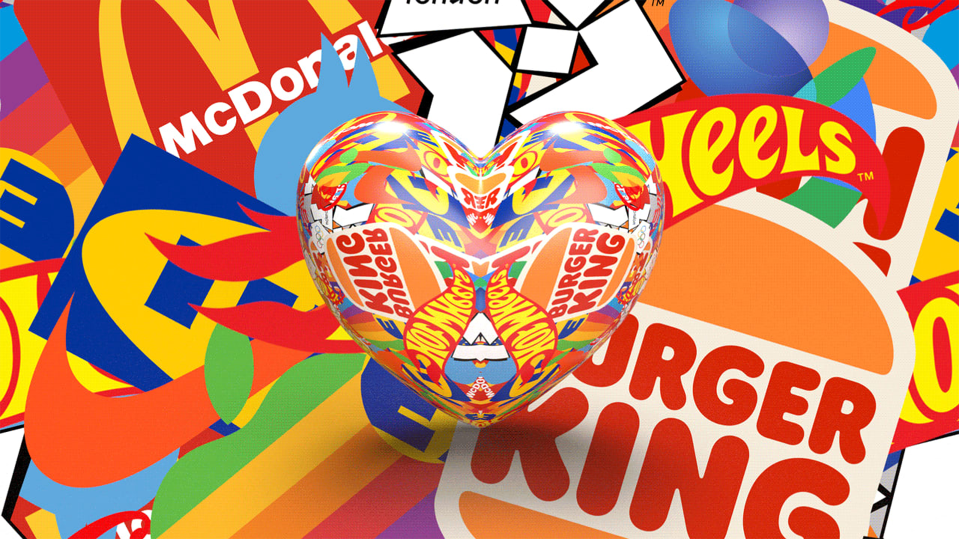
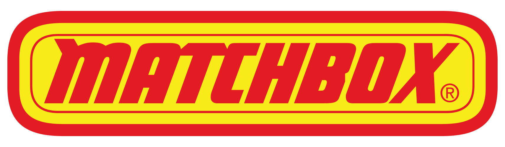
I’ve been designing logos for over 20 years. I’ve loved them for as long as I can remember—as a kid, I got more excited about my Matchbox car packaging, with the big flaming muscle-car logo, than I did about the car itself.
I spent most of my career thinking that people could care less about logos, but over the years I’ve come to realize that actually, we really do. We just don’t know it.
So, what is it about logos?
I’m pretty sure they’re not on the minds of most people, most days. It’s only when they get taken away from us that we start to care.
And while the design community rips new logos to shreds based on tiny details and seen-it-before syndrome, the general public, which is the real audience for our work, gets angry and upset.
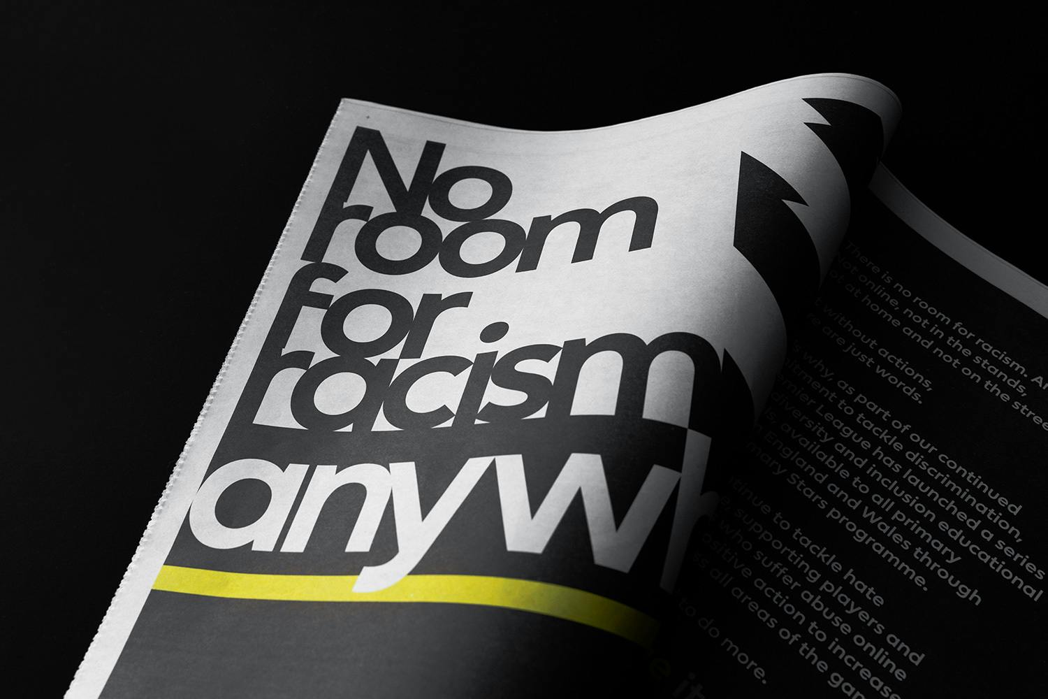
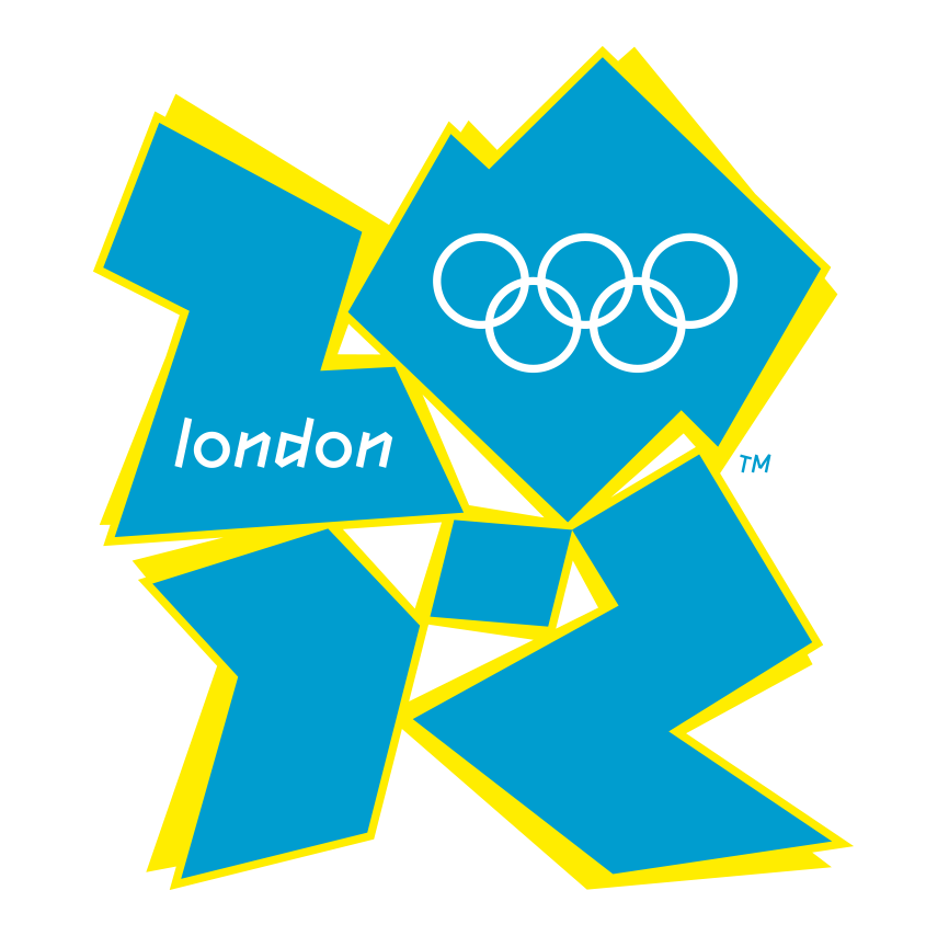
I remember watching the Sun newspaper going front-page apeshit over the new BT logo we’d created at my first agency, and the paparazzi hiding in the wheelie bin of the designer who created the 2012 London Olympics logo, waiting to get a shot of the man who single-handedly created national outrage. Strange things to do if no one cares.
And this is the common theme surrounding any high-profile logo change. Big. Brutal. Backlash. Shock. Uproar. Disgust. And then pushback to what was before. This is what I’ve been trying to understand.
The shortcut to memories
The answer is simple. Because Eric Cantona wore that logo, not the new one. Because Manchester United lifted the trophy with that logo engraved in the handles, not the new one. Because we all have 25 years of memory structures connecting that logo to our favorite football memories. And that was being taken away. The link was being broken.
“The answer is simple. Because Eric Cantona wore that logo, not the new one.”
Put another way, it’s not really about the design of the logo. It never was. It’s always been about what a logo represents. Logos are a shortcut to memories. Take away the logo, and you remove the connection to all of those moments you associate with that brand. This is especially true with sports brands and teams, but we see it with every kind of brand. The uproar against Gap was so big they were forced to change it back. I mean, who really cares about the Gap logo? Turns out we all do.
So not only do new logos hold no meaning (this has to be built over time), but they also take away the thing that did. A double whammy to the audience we’re trying to attract.
Feel-good memories
Nostalgia is a big warm blanket to wrap around ourselves, especially during the uncertain times we’re living in. Just look at JKR’s stunning Burger King rebrand. A wonderful walk down memory lane, a brand that takes us back to a happier time. Sure, it’s an exciting, modern, digital-first version of a memory, but it just makes us all feel good. It may be a rebrand, but by rooting the new work firmly in the memory structures that Burger King has built over the years, it doesn’t just propel long-held positive associations with the brand into the future—it successfully protects those positive associations from the past. It’s as at-home today as it is in Stranger Things’ Starcourt Mall, and it’s backed up by an outpouring of optimism. In fact, I haven’t read one bad review or comment.
“The job of a logo is to be a shortcut to your offer.”
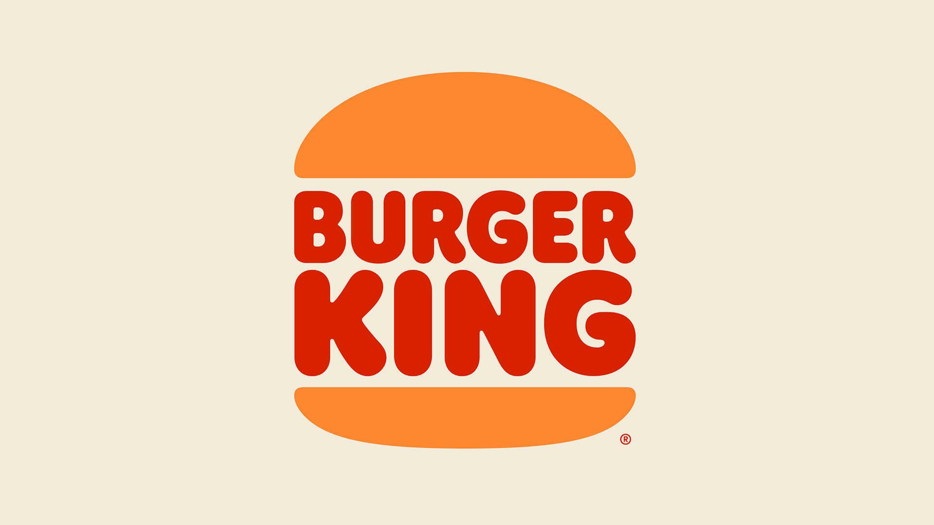
The job of a logo is to be a shortcut to your offer, capturing neatly what you stand for and what makes you different. Burger King managed to find the Holy Grail of moving their brand forward while strengthening memory structures with their fans at the same time.
The best logos set off chemical reactions in our brains when we see them. When I see Disney, I’m immediately hit with a sense of wonder, adventure, and storytelling. When I see Hot Wheels, I’m transported back to my childhood. And the list is long: We recently asked our Instagram followers about their favorite childhood logos and received thousands of replies.
“The best logos set off chemical reactions in our brains.”
This may explain why we’re seeing a trend of brands looking to their past as a starting point for them to move forward. We’re seeing it in film, fashion, food. Even chess has made a comeback.
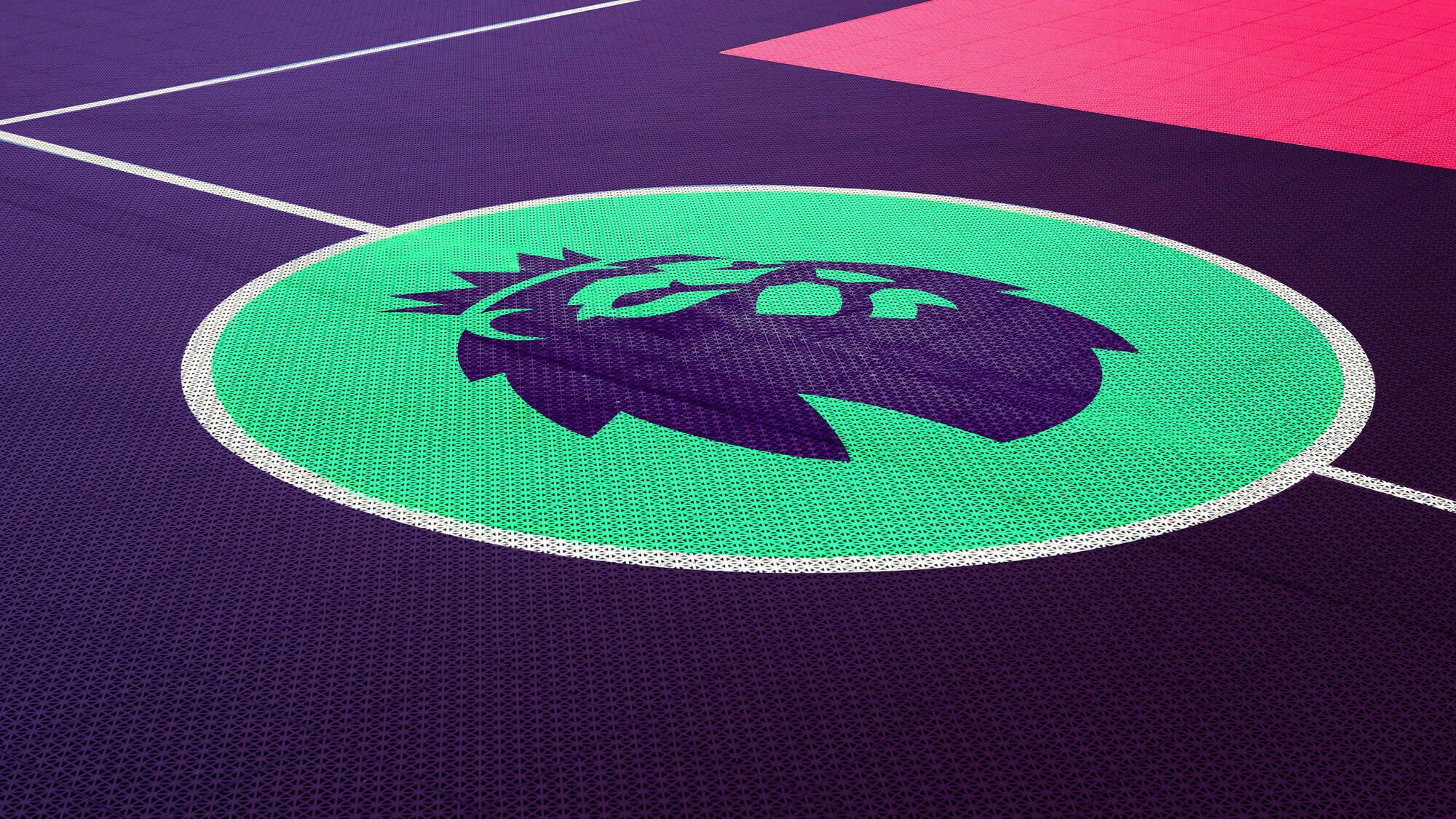
The good news is that in most cases, the initial uproar over any rebrand has no bearing on its success. Within a year of its controversial rebrand, Airbnb successfully doubled bookings to 80 million, adding billions to their bottom line. Same for Premier League and countless others. Once we’ve built new memories and connections (such as seeing Raheem Sterling wearing the new PL logo on his sleeve), we accept this change and move on.
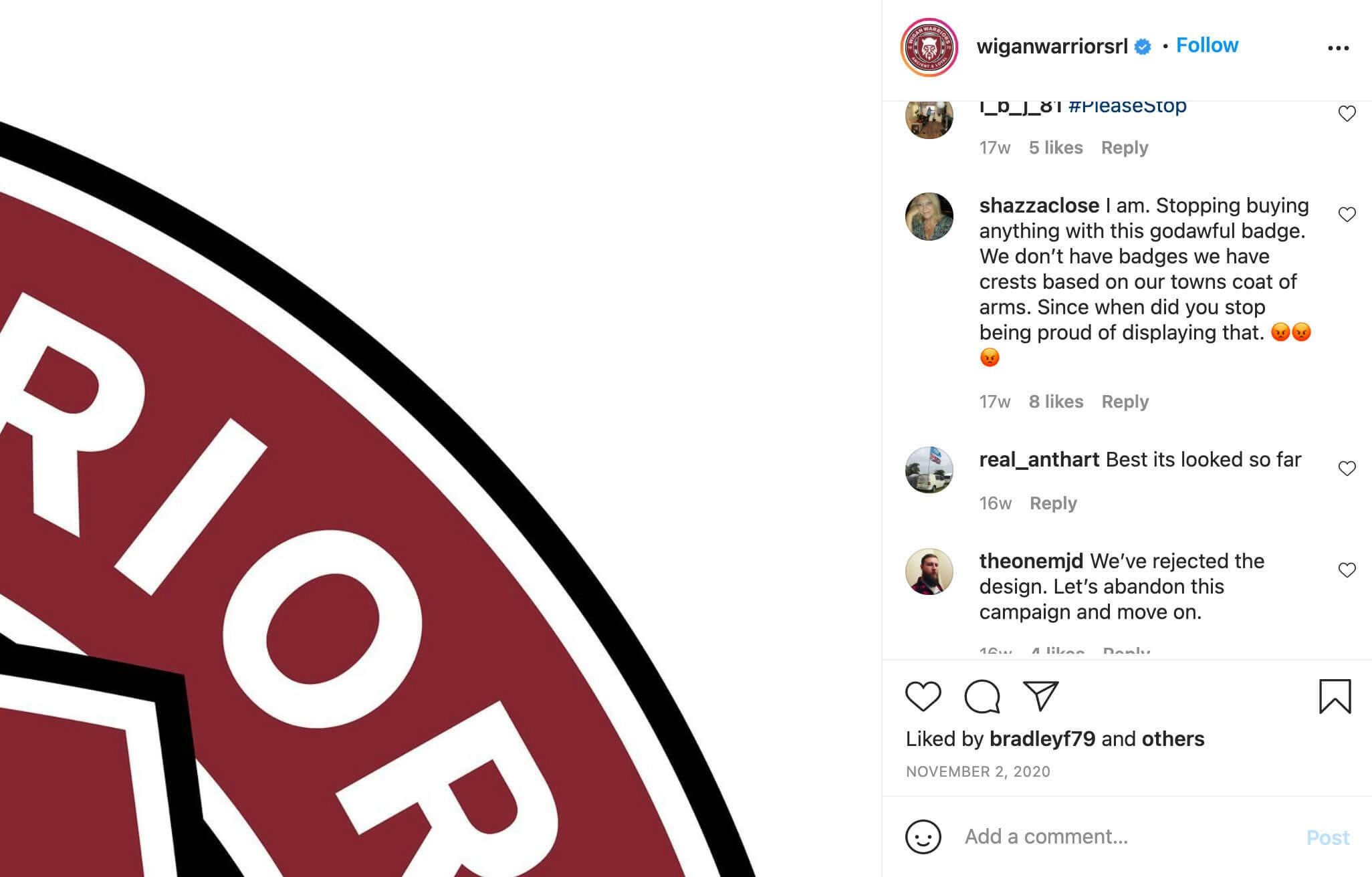
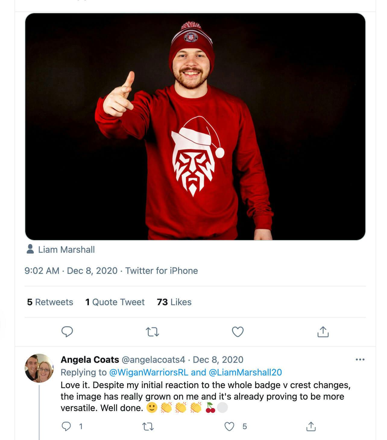
Take our recent rebrand of the rugby team Wigan Warriors—it took exactly two weeks and a Santa hat to go from being despised and rejected (and me being the most hated man in northwest England) to understood and accepted. We simply join the dots and move on.
You don’t know what you've got ’til it’s gone
So, I guess what I’m saying is that we all love logos. We love them for what they stand for, for the memories they hold. The worlds they transport us to. We just don’t know it until it’s too late, and they’re gone.
As a designer, I’m glad that logos matter to people. We have a responsibility to do the right thing. But ultimately, we have to become less obsessed about what a logo looks like and more in tune with how it makes us feel.
After all, we’re in the business of making memories.
Stuart Watson is the founder and creative director of Nomad and recently created the brand for Disney+ STAR. Other clients include Premier League, Nike, Sky, The FA, and Cannes Lions.
Check out...