Reimagined for the next chapter.
Designed in consultation with a specially formed fan group, this process enabled the club to take a radical leap forward as they embrace an exciting new future designed for digital and broadcast presentation.
The message was clear from broadcast partners. The sport has to adapt and burst out of its bubble to attract not only causal fans, but the next generation of loyal supporters who will fill stadiums, buy replica shirts and subscribe to pay TV. This rebrand is part a strategic journey to modernise the game, and secure its long-term future.

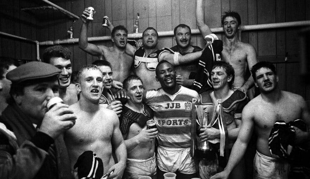
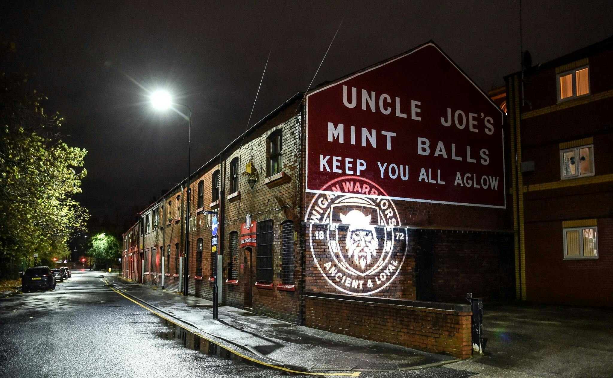
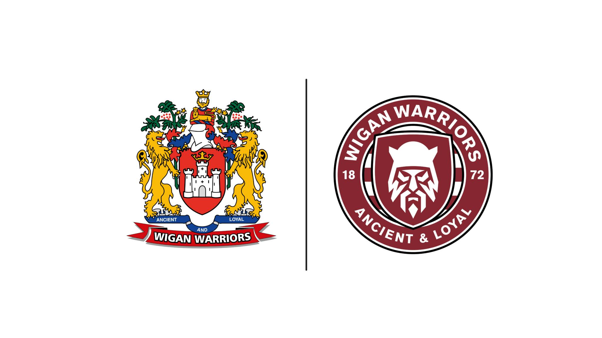
Engaging with fans and the club led us to creating a unique Warrior icon, specifically the Brigante; the tribe that inhabited Wigan before and during the Roman era (also the name of the club fan group), known for their catchy outfits, excessive use of war paint, and unique helmet design.
The name Brigante, meaning prestige, power, reputation, honour, and dignity — all of which we aimed to capture in the powerful expression of the warrior, with the club initials (WW) etched into the beard. Nomad worked with friend and collaborator, Chris Mitchell to craft the expression of the Brigante Warrior to mirror that of the warriors on the pitch, and invoking fear into opponents.
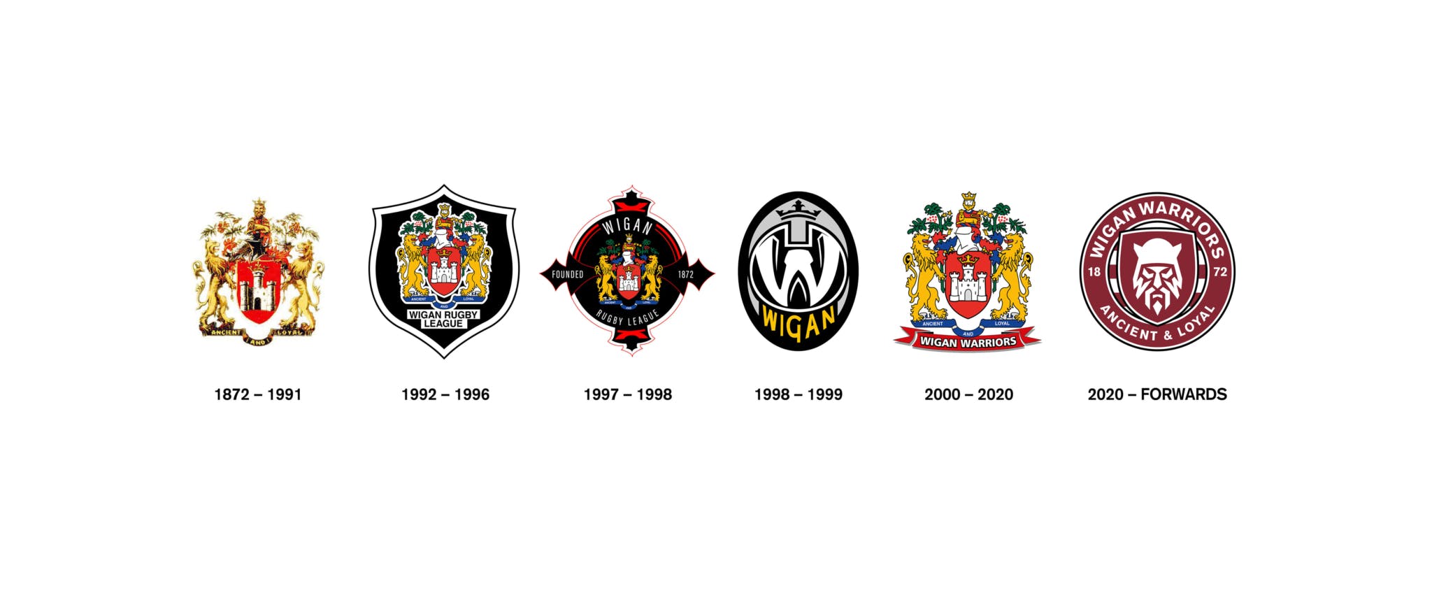
The current logo will now become a heritage brand, used alongside the new crest as a symbol of quality and history.
Where others follow, we lead.